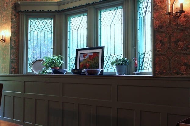
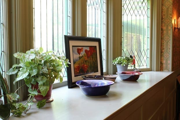
The dining room is one of my favorite rooms in the house. I love the leaded glass, and all of the shelving. The room is spacious and bright for part of the day.
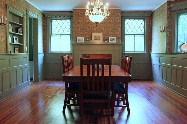
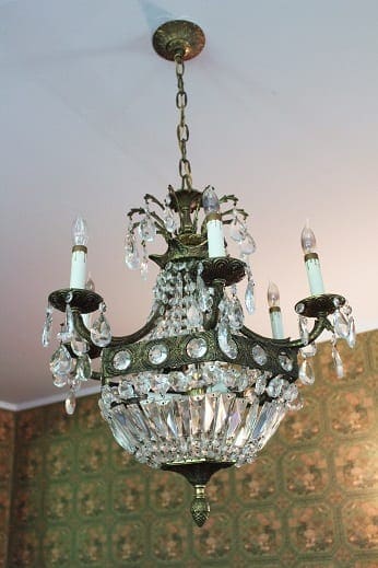
We all love the chandelier. The kids think it is one of the greatest features of the house. I never thought of us as the type of people who would have such a fancy light fixture in our home. They always seem a little fussy, and we are a low maintenance family. However, it fits this house, and it is staying as long as we are. It turns out that we are chandelier people after all.
To-Do List:
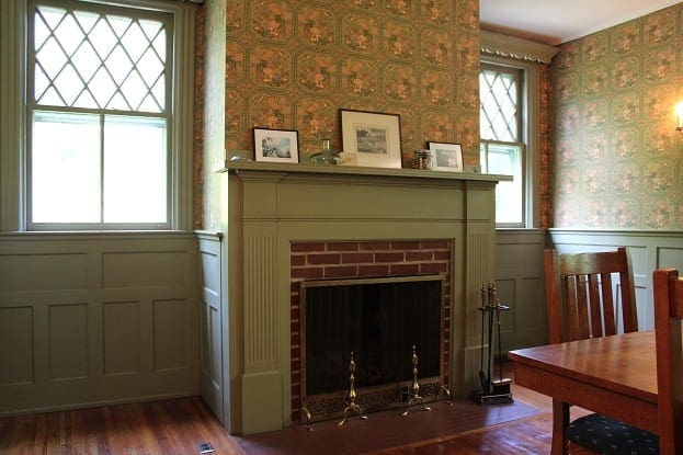
- Repaint all of that green trim. Color TBD.
- Remove the wallpaper, patch the walls, and repaint. Color TBD
- Get a rug for under the table.
- Recover the seats of the chairs.
- Have the fireplace inspected, and perhaps buy a wood burning stove insert to increase efficiency.
This room opens into the foyer which opens into the living room. The three rooms will probably need some continuity when we decorate, since they all flow into one another.
Yesterday, I got such great reader tips, in the comments and on facebook, regarding the living room. I am interested in hearing what you might do with this room too.


9 Comments
Robin
I gotta say, in a dining room, I don’t hate that green. But with much better wallpaper. But of course I’m just looking at pictures of it, and it might be much more garish in person.
stacyfg@gmail.com
You have made me consider if I am being too hard on the room. I think it is that the three spaces together, the dining room, living room and foyer, clash so much together that I want to banish everything that is painted green. In the dining room, the color is definitely more sage, and maybe it could be salvaged. There is some mildew on the paint on the left side. That will need to be addressed.
Kelly
Wow, the lady before you had great taste! It makes me curious what the room looked like before she did this. It must have been a room full of brown? What is the wallpaper design? I don’t even mind it in this room. I’d hang some really big pieces of art to cover some of it up. Are the floors original? They are beautiful and those windows!! I’d have my collection of vintage fiestaware there in the bay area. Wow – Awesome room.
stacyfg@gmail.com
Dorothy did have really good taste overall. She loved color, different patterns, and the color green. All together, it is a little hard on the eyes. The green in this room is more sage than dark green as it is in the living room. In my effort to tame down the pattern mix, I may just have a bias against everything in this house that is green. 🙂 I am only in a rush to remove the wallpaper. Perhaps the green can stay for awhile.
Also, I love vintage Fiestaware. I bet your collection is beautiful!
Linda
Stacy, I love this room and I love green but would probably want it a clean white ( at least the bottom half) to really pop the bricks and the floor. The light that comes in from those cool windows is amazing!
stacyfg@gmail.com
I am a huge fan of white too. It just looks so clean and bright. I love the window too. Thank you for your reply. Glad you are on a fire break. 🙂
Jan Elizabeth
That sideboard with all the trim is amazing!! Wow. I would choose white for the woodwork as well. And while the chandelier would be too fancy for many spaces, it looks perfect in there.
Liz
I found your site via Frugalwoods. Your house is awesome – be still my heart! I’ve been poking around and checking out all your photos. I actually love the look of this room – paint color and wallpaper included. I buy old houses *because* of the vintage wallpaper and am often a big fan of the colored woodwork when done right with the right paper. I work in real estate and get so, so bored and sad about all the painted walls I see in MLS. Good wallpaper makes a room look so cozy – just like your dining room!
Stacy
Hi Liz, Thank you for reading and commenting. I love Frugalwoods. 🙂 I am afraid that most of the wallpaper did not make the cut as you may have noticed upon further reading. Most of the wallpaper in each of the rooms has been in various states of disrepair which is something that photos hide quite nicely. I hope that the lack of wallpaper will not dissuade you from continuing to read about BHH. We are glad you are here.