If the six weeks of the One Room Challenge was a complete lifetime, birth to death, week three would be the angsty teen years. This week, I questioned everything about our project. Is it too much for six weeks? Will I finish? When will I find the right color of paint? Everyone is looking at me, and I am not holding a pumpkin spice anything! I am a terrible blogger. Without pumpkins, this blog is nothing. I should just quit. Oh! The drama.
To top off the whole insecurity spiral, I fell while running, and I have a badly sprained finger on my left (dominant) hand. Fortunately, X-rays showed no broken bones. However, it is harder to function with my fingers taped together. I have been taking the tape off every day to paint or type, and I put it back on when it just hurts too much. Regardless, I shall prevail, and quit complaining.
This week’s post was supposed to be a window update, but I have pushed that to next week. I was unable to work with glass or power tools safely with my compromised left hand. Instead, I will talk about paint.
Light or Dark?
I am quite sure that I beat that question within an inch of its life. The only thing I knew for sure was that I was going to paint the ceiling haint blue to keep loosely with tradition. A couple of months ago, when I was planning this project, I bought a quart of the color Cay by Sherwin-Williams. I have been planning this entire project around that color. It was the only sure thing.
This week, I spent days considering dark walls with dark trim, light walls with light trim, dark walls with light trim, light walls with dark trim. Ahhhhhh! Since this is not my typical method of operation, I blame the injury; it was frustrating and annoying. I gave myself a stern talking to as I was eating my third spoonful of peanut butter. (When I am anxious, I stress-eat peanut butter.) Then, I marched right down to the closest paint store, and I made up my mind.
I chose Sherwin-Williams’ Mount Etna for the walls and trim. Decision made.
While I was there, I decided that the color for the ceiling, no longer worked with Mount Etna, so I picked up a quart of Tidewater, also by Sherwin-Williams. (Yeah, so much for Cay being the only sure thing.)
Everything was coming together. When I got home, I immediately got to work. I painted the ceiling in about forty-five minutes. It looked terrific.
Then, I got to work on the walls. I decided just to do a small portion to see how I liked it. Mount Etna is a beautiful color, but…I did not like it at all. Sigh.
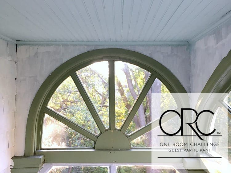
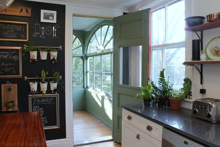
What I love the most about the breakfast nook is that it feels almost like being in a tree house. When we are sitting in this room, it is a beautiful peek into nature.
I realized that by painting it a very dark color, the breakfast nook would feel more like a cave, and that was inconsistent with my vision.
So, rather than reinvent the wheel yet again, I decided to consider paint colors that I have already used and love. By limiting my choices, settling on Agreeable Gray was easy.
To refresh your memory, we used Agreeable Gray in the dining room last fall when we participated in the One Room Challenge.
Combined with our go-to Citilite for the trim, it will be the perfect bright neutral palette for the breakfast nook. It will go well with our new kitchen, a blue ceiling, the stenciled floor, and the dandelion paper by Cavallini & Co. With this decision made, I am moving out of the teen years and straight into adulthood.
Thank you for bearing with me this week. Next week’s post will have more action and less drama. I promise.
When you get a chance, head on over to Calling It Home to see all the progress from the Featured Designers and the Guest Participants too. Some of them are sitting at the angsty teen lunch table with me. Life is a struggle, and everyone is staring at our acne. Others seem to be moving through this challenge with popularity and ease. Life clears the way for them. Yes, we hate those people and their buttery smooth complexions so much. Ha!

Start from the beginning:
Week 1 – The Breakfast Nook
Week 2 – The Breakfast Nook






20 Comments
SH
I’ve been on team dark windows since the beginning, but have really liked all your BHH reno choices thus far, so I am cheering you on with the white trim. Looking forward to seeing this nook get painted! (There seems to be a renewed enthusiasm in your writing today.)
Stacy
Thank you, SH! I am crossing my fingers that this color combo will be a winner. 🙂
Andrea
One of your funnier posts today! It made me laugh out loud, the angsty teen lunch table theme. With all those windows, that room was never destined to be a true cozy cave. I expect the Agreeable Gray will be delightful, and it’s always nice to repeat some colors through the house, I think. It will be glorious!
Stacy
😀 Thank you, Andrea! I figured that since I barely have anything to show for a week’s worth of work, I better darn well be funny to make up for it. Also, interpretive dance as a time filler does not translate well through writing, and my skills in that area are lacking anyway.
Audrey
My husband says I pick good paint colors… on the second go-around. It takes WORK, and sometimes re-doing the work. And then re-doing it again. You’re not alone at the angsty table. I like that as a paint name, actually. Angst by Benjamin Moore.
Stacy
Oh my gosh! You are right. Angst is such a good paint color name! LOL Give it a month or two. One of the paint companies will use. It’s a winner. 😀 All credit goes to you.
Jen @ Noting Grace
How wonderful to realize that the paint color doesn’t work. I know that sounds odd, but what I love is that you are listening to your house and your intent for this room. The new color choices sound wonderful! Are you keeping the haint blue?
Stacy
I am sure trying to listen to it, but it just keeps telling me to eat more peanut butter. 😀 The haint blue stays for sure.
Ame Hughes
How sad is it that I get excited reading about other people painting their houses? ? Can’t wait to see it all come together!
Stacy
So sad that I know you are sitting at the same lunch table with me. ? You’re probably my best friend. (I like seeing how other people paint their houses too!)
tim@designmaze
grey is always classic and beautiful … I am still so very jealous of your gorgeous windows! can’t wait to see more of your breakfast nook!
Stacy
Thank you, Tim!
Emily Vanderputten | chez V
You had me with the pumpkin comments. I would like to start a Take Back the Pumpkin and Leave your Spiced Everything campaign. Seriously, the spread of pumpkin spice is an epidemic. I prefer my Cheerios honey nut flavored and not pumpkin spiced. Thankyouverymuch. In other news, the paint conundrum is real. We experience that acutely over here. The ONLY color I was sure of going into this ORC has been cast aside as well. I feel you.
Stacy
Haha!! No pumpkin pasta sauce either? 🙂
I am sorry that we are having the same paint color dilemma.
Jenny
I like what you ended up with on the colors–I think that Etna probably would have worked, but the lighter gray is probably a little easier to live with and will bounce the light around. 🙂 Love the haint blue ceiling!
Stacy
Thank you, Jenny!
Madeline | Teal and Gray
Your poor hand! Ouch. I have successfully scraped and bruised all of my knuckles whilst scraping and mudding, I look like I’ve been in a fight cub.
I totally sympathize with the paint color choosing, it shouldn’t cause so much anxiety, but it just does and that’s that.
I’m sure it will loom amazing when you’re done though!
Stacy
Thank you, Madeline. Your scraped hands sound painful too! Fortunately, it looks like I may have turned a corner regarding recovery. My hand is still weak, but it does not hurt nearly as much now.
Susanne
I am so happy for you that you finally decided on a paint color!! I hope your finger gets better soon an d I can’t wait to see your progress next week!!!
Stacy
Thank you, Susanne!