Typically, on a big reveal day, I feel content. I love reflecting on each project. It is so satisfying to finish 100% of a room renovation. However, today’s post is a little different. Despite all of my effort, I did not finish the cabinet under the sink. I built and painted the doors, but after a series of errors, I have opted to put that project on hold and share the big reveal anyway. In the next couple of weeks, I will get back to it, and when the cabinet is finished, I will share the whole story here on the blog. For now, the Butler’s Pantry is mostly in order, and I am embracing good enough in place of perfection.
Before
Here is the original to-do list:
- Remove contact paper from the shelves. – Done!
- Paint the walls and the cabinets. – Done!
- New Shaker-style doors and hardware on the sink cabinet – Mostly Done!
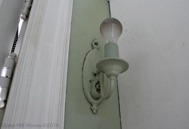
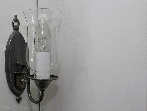
- Restore the light fixture. – Done!
- Create an organizational system on the shelves and in the drawers. – In Progress
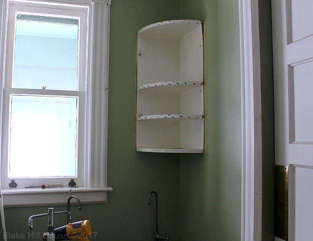
- Remove the corner shelves. – Done!
Along the way, we also stenciled an accent wall.
The Butler’s Pantry always had great bones, but it was so very green, and some of the later additions to the room took away from its charm.
After
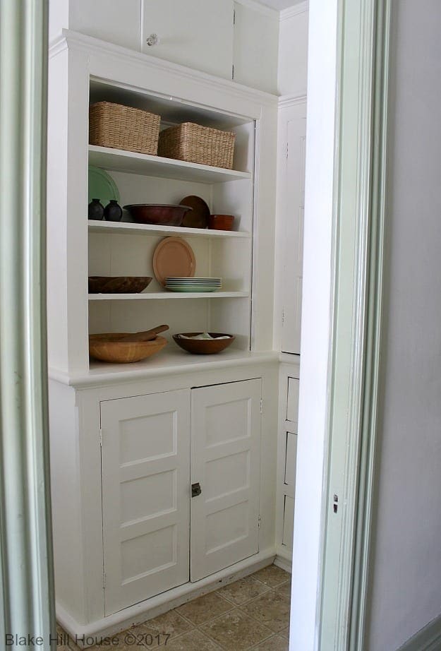
This room serves as a pass-through from the entry hall to the dining room, and I decided to stick with the same basic colors so the decor is cohesive.
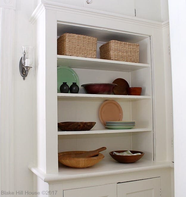
The shelves are a work-in-progress. Most of these items I had on hand. Everything else came from the thrift store, flea market or local antique stores. I have a thing for wooden bowls and cutting boards. My plan is to beef up the decor with more wooden items. However, I am not one to rush out to buy things just to fill up a shelf or a room.
The upper adjacent cabinet used to look like this:
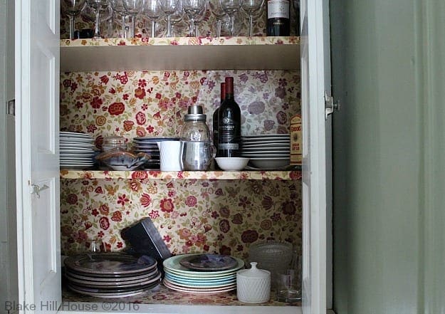
Now, it looks much cleaner and neater.
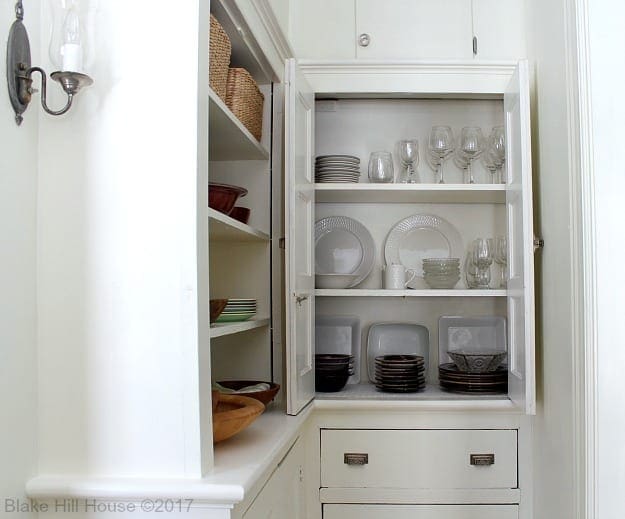
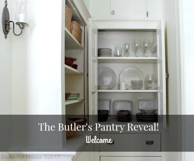
I should mention that I also have a preference for white dishes. It is a quirk of mine that I think food looks more appetizing on bright white dinnerware. None of the items in this cabinet are new. I did some decluttering, removed the flowered paper, and gave the cabinet a fresh coat of white paint. Then, I lined the shelves with high-quality white shelf paper. I tucked the small amount of wine and liquor that we own back into the blind corner. I toyed with the idea of putting a wine rack in the cabinet, but I decided it was not necessary.
Currently, the drawers and the lower cabinet are empty.
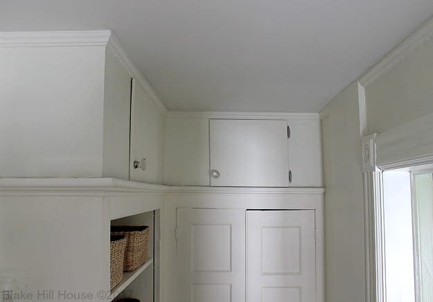
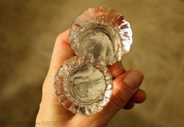
The cabinets at the very top are also empty. I switched out the plain wooden knobs for some beautiful glass knobs from Anthropologie.
The other side of the room has undergone the biggest transformation. Previously, it was entirely green, and the corner shelf unit was a catch-all for lost items.
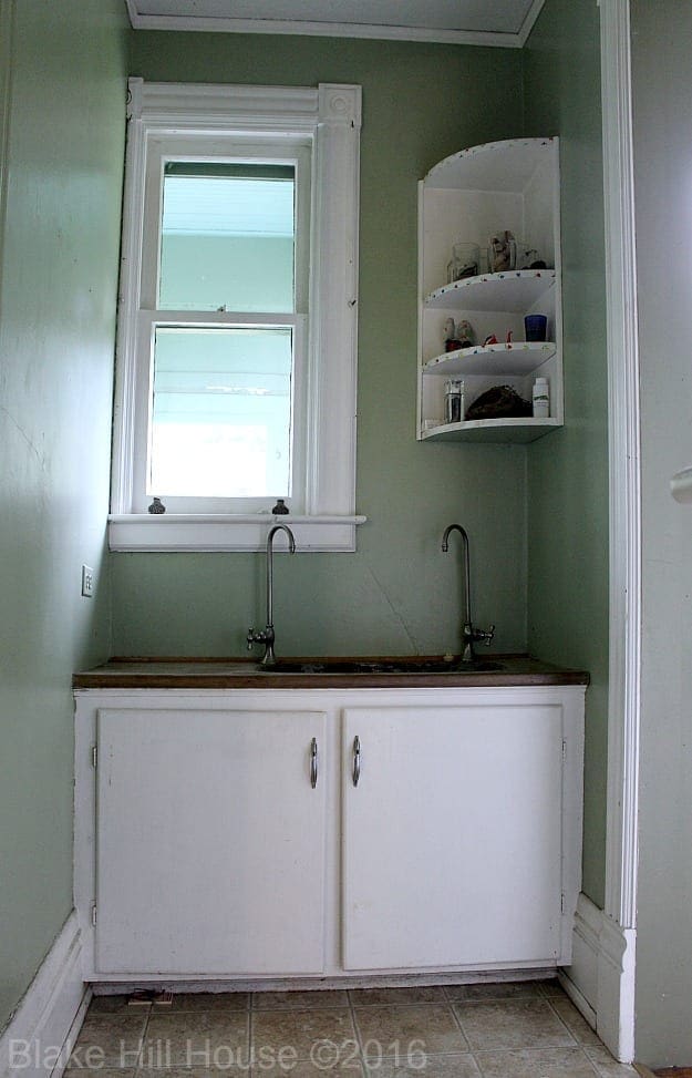
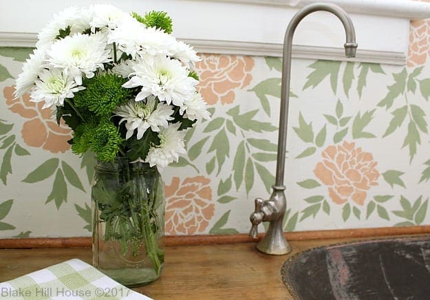
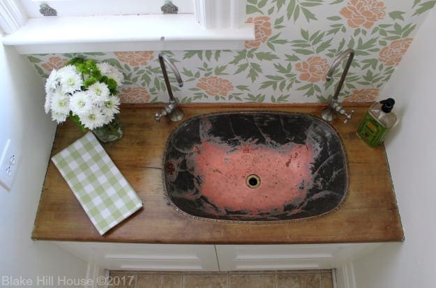
I removed the corner shelf unit, stenciled the accent wall and built new Shaker-style cabinet doors. Now, it looks dramatically different:
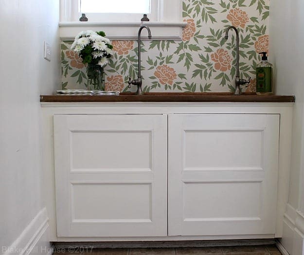
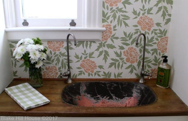
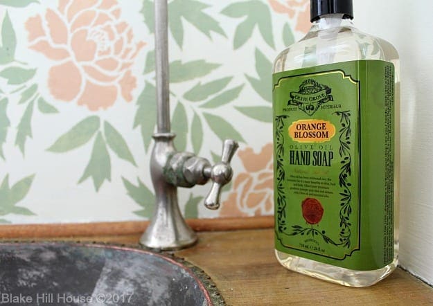
Even though the cabinet still needs work, hands down, this is my favorite part of the room. The stenciled wall prevents the Butler’s Pantry from looking too stark, and the cabinet doors now blend in with the original cabinets on the opposite side of the room.
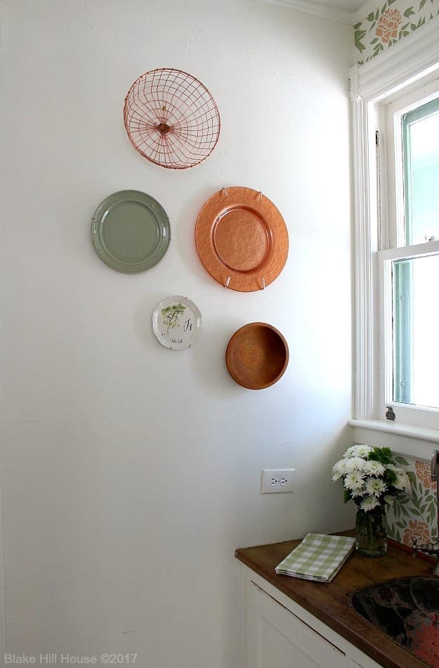
On the wall to the left of the sink, I hung decorative plates and bowls. I want to add more items to that wall in the future. The current effect is a little sparse. My struggle with comprehending scale continues. I have written about that in previous posts.
We swapped out the painted green outlet for a white one. Sadly, it is crooked because the box inside was installed that way. We are calling it old home charm since we are optimists by nature.
This is a peek from the dining room. That wall definitely needs more of something.
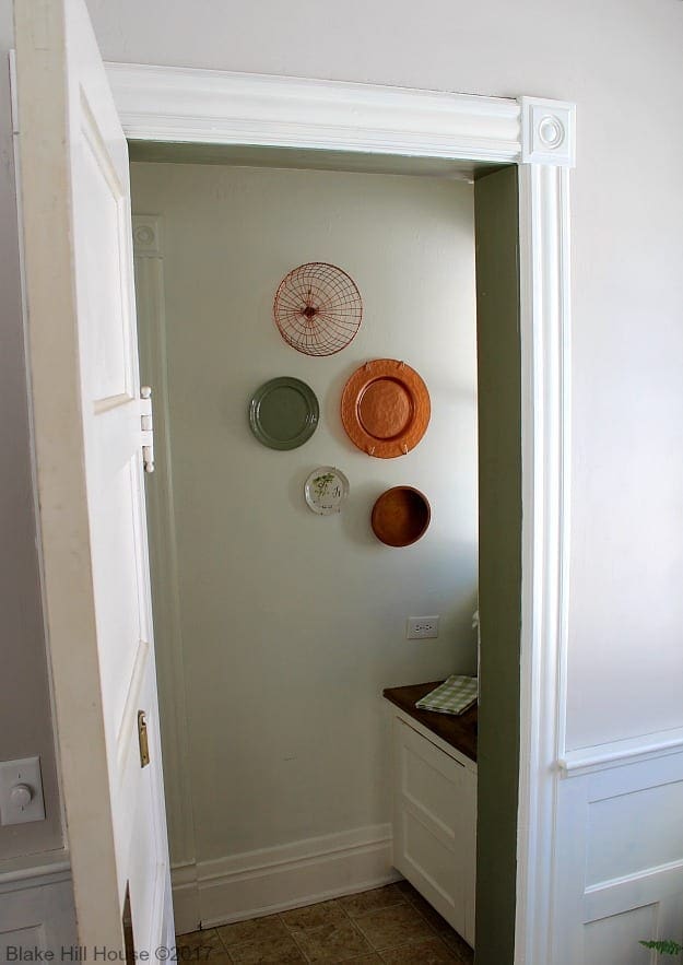
In addition to the cabinet, we will address the floors and the baseboard shoe trim which is in terrible shape. The hall and the Butler’s Pantry floors are the same worn out vinyl that was in the kitchen before we remodeled. We will be removing all of it and refinishing the floors during the summer, if not before. At that time, I will do all of the finish painting and shoe repair down near the floor. Once that work is complete, we will add an accent rug.
I am so pleased with this room now. BHH is a big house at over 4400 square feet. I find that my favorite rooms and projects tend to be these small, hidden away spaces that are full of charm and obsolete in today’s modern architecture. Sadly, our house is without a butler, but nonetheless, if one shows up, this room will be ready.
We would love to hear your feedback. Did this room turn out like you expected?
In the next few weeks, I will be working heavily on our new podcast. In addition, I will finish some extra projects before the One Room Challenge™ begins in April. So, in the next few weeks, I will be sharing all of those odds and ends on the blog. There is never a shortage of work here at BHH.




23 Comments
Andrea Matters
Oh, I’ve been Waiting and Waiting for this post! How lovely it looks, so fresh and bright and yet also very respectful of its history. The sink and the stenciling are my favorite things. A+!
Stacy
Thank you, Andrea. 🙂
Liz
Well worth the wait and work! It’s so cheerful and authentic. I admire your patience in restoring little details such as the light fixture. It’s altogether lovely.
Stacy
Thank you so much, Liz.
Ame Jo
Oh, Stacy, it looks wonderful. What a fabulous job you did! And I bet having one less green room is a relief, too.
Stacy
Thanks, Ame. We have three more green rooms to go! 🙂
JC
I really love that stenciled wall. That turned out great. I also love the refreshed cabinets. I think the top parts were added later, and if there’s one thing I’d change, it would be to remove them, and have the tops open. I’d do either wicker baskets on top, or have some items on display. I do see, however, that removing them could be a pain in the butt because of the small crown that was installed around the whole room (and over these cabinets). I guess maybe I’d make matching panel doors instead then. It’s only a pantry, but I’m really picky with details. Knowing me, I’d go through the trouble to either remove the upper cabinets and fix all the crown, or I’d scrap the small doors and make matching double doors.
Anyhow, I’ve gotten off track. The room looks great, and I like what you did with the light fixture, too. So many people junk these old fixtures, but they’re so well made.
Stacy
Thank you for your input, JC. I am sure that the uppers are later additions. The cabinet doors are the same as the cabinet doors under the copper sink that got a makeover. Also, the open shelves were a pass-through to the dining room. Based on the supplies used, the changes were probably all made at the same time circa the mid-1950s.
Courtney @ Foxwood Forest
Stacy, I think it looks so great! I especially love the stenciling on the wall — so pretty!
Stacy
Thank you, Courtney! 🙂
Jenny
It looks great–very fresh and clean but authentic to the house. I love the stencil–it’ll be nice to have a touch of spring year round! 🙂
Andy
Great job! I hope the butler likes it.
Stacy
Well, do you? 😀
SH
So glad you didn’t wait until everything was complete. You did an especially nice job on that quirky wall: the sink and window don’t align with the center, nor each other. And the stenciling adds the perfect amount of eye-grabbing attention! The future finishing touches will add a lot, but I think I can feel the clean and freshness from here!
Stacy
Thank you. 🙂 Yeah, that wall was a weird challenge.
Barbara
Great job! The stencil is lovely and I like the minimalist look. In terms of the plate wall, I’d mix in something reflective like a mirror or some old silver platters to bounce back some of the light from the window.
Stacy
Good idea! I’ll keep my eyes open for something that might work. Thank you for the suggestion, Barbara.
Dawn
Absolutely stunning!!! I love all the charm in this space, you’ve brightened it up beautifully! (And you butler comment made me giggle)
Enjoy all of your hard work!
Stacy
Thank you, Dawn! PS: I’m still waiting for a butler.
Julia at Home on 129 Acres
Congrats on finishing another room. I really like what you did with it. I think my favourite part is the light fixture. So much better without all that paint on it! What about adding more plates to your plate wall? I’ve had this image pinned for years, and I like how it’s high and low. It almost seems to flow along the wall: http://mmmcrafts.blogspot.ca/2011/05/corners-of-my-house-foyer-plate-wall.html
Stacy
Thank you, Julia. I love that pin! Thank you for sharing it. I think you are right that if I add more plates and bowls it will start to look better. I appreciate your help.
Hazel Avery
What a great article. I love your pantry. The white is to die for. I’m trying to get a fresh cabinet painting soon in my own place, and seeing your design was really helpful to me. Thanks for sharing!
Stacy
Thank you! Good luck with your project. 🙂