I just returned home from a trip to Japan with my oldest boys. Two words: Jet lag. Wow! My body clock is all messed up. Hopefully, it will sort itself out in a day or two. We made some wonderful memories, and I took loads of photos. I’ll write up a travelogue post soon. In the meantime, there was a big box of wallpaper samples sitting on my desk when I got home, and choosing wallpaper for the front entry is on my mind.

Project Inspiration
I have plenty of summer work to finish before cold weather arrives, but dreaming about sprucing up the entry hall is a nice distraction. It all started with this photo on Instagram:

You all know that I tend to play it safe with neutrals when it comes to decor. In fact, Andy always teases me about painting things beige. Once, in our house in California, I had grand plans to repaint a beige wall in our living room–vowing to choose something different. I spent nearly an hour in the paint store fretting over undertones and sheens, shuffling paint chips like Uno cards.
Finally, I was satisfied with my choice, but when I brought it home and opened the can to show Andy, I discovered that there was no discernible difference in color between the beige paint in the can and the color already on the wall.
Based on history, imagine my surprise when that bright orange entryway photo not only caught my eye, but I immediately imagined something similar for BHH. I was officially inspired.
The Wallpaper Hunt Begins
Right away, I asked all of the smart people on Instagram if they knew where to find that wallpaper. It reminded me of Laundry Studio designs, but I could not locate an orange colorway. Hollie, from Stuck on Hue, recognized the paper immediately, and she sent out a sample the next day. How generous!
While I loved the way it looked from this angle next to the street side front porch…

…Unfortunately, there wasn’t enough pattern contrast looking into the foyer, and the colors did not coordinate with the existing toile. Choosing wallpaper for the front entry wasn’t going to be as easy as I thought. (Please ignore the green trim. I will be repainting it.)

While I loved the room designed by Brian Patrick Flynn, I realized that I needed to stick more to the spirit of the design rather than the exact look. I tried to parse out precisely what I loved about it–the orange color, the mix of art, the warm feeling it evoked. That exercise led me back to my computer, where I ordered a load of new samples from Etsy and Spoonflower. As a former Californian, I was drawn to patterns with citrus.
Choosing Wallpaper for the Front Entry | More Samples
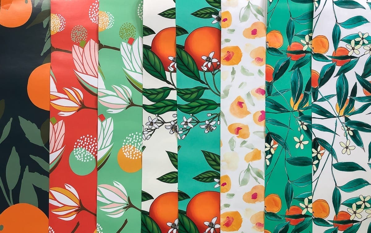
The first citrus sample to arrive was this transitional print.

At first, I loved it, but the longer it hung there, the more I realized that even though the colors worked, the stylized citrus pattern didn’t play well with the traditional toile in the foyer. It was a traditional vs. transitional fail.
When I opened the box that arrived while I was in Japan, I eliminated some prints immediately. Seeing the wallpaper for real was very different than viewing it on the computer. My advice? Always order samples.

- Too stylized
- Too mid-mod
- Mid-mod in green
- Cartoonish
- Cartoonish in turquoise
- No. Just no.
- Cute, but not feeling it.
- Not feeling it in white either
Not all of the samples were a complete miss. Just for fun, I gave these two a shot.

Because I loved the print so much, I wanted one of them to work, but it was clear that it wasn’t meant to be. The adjacent toile begged for a more traditional design.
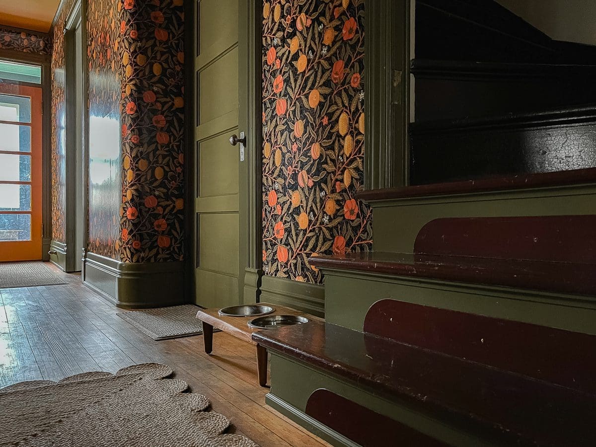
Luckily, I ordered a William Morris print in four different colorways. The two orange samples were the clear front runners.

Here is how they looked on the well-lit side of the hall.

And this was the view into the foyer.

Winner! Winner! The William Morris print is larger + traditional, and it coordinates well with the classic toile in the foyer. Out of curiosity, which one of these two is your favorite?
Choosing Wallpaper for the Front Entry | Next Steps
I suppose the next step is convincing Andy that orange wallpaper is a thing and it belongs in BHH. After that, all that’s left is opening our wallets and doing the work. I’m toying with the idea of turning this into our fall One Room Challenge project. However, I’m still really excited about working on the Cabin Vibes bedroom too. Feel free to weigh in. Which room renovation would you like to follow first?


40 Comments
Cathy
I ALWAYS go for the orange in anything! So orange colorway would be my choice but I am betting you chose the dark, which is almost equally gorgeous.
Stacy
It’s a tough call!
Sara Kalashian
Love the lower! Good luck!
Stacy
Thank you, Sara!
Andrea Matters
I love the lower one with the dark background. The upper sample is very pretty, but to my eye it looks a bit restless and fidgety against the toile, probably because the fine little brambly lines are more visible. The dark sample seems strong and stable, and the two papers (Morris and toile) really enhance each other.
Isn’t Japan wonderful?
Stacy
Your thoughts make sense. The darker paper also mitigates the orange of the floor a bit too.
Japan is wonderful. I’d love to go there again.
Sabrina
Oh, the dark background for sure!
Stacy
Noted! 🙂
Shelley
I’ll be the third vote for the darker paper. As far as One Room Challenges go – I’d vote the cabin room makeover because it’s another “working” area of your home (isn’t that where you set up to record your podcasts)?
Stacy
The darker paper is winning the symbolic vote on Instagram too. As for the bedroom, I’ve started recording the podcast downstairs in my office which is working ok–not great, but ok.
Sam Jarman
Glad you made it home safe and sound! I love both of those samples…the black background is my favorite though. It is a beautiful compliment to the toile. As for the Fall challenge, I am super excited to see the entryway transformation!
Stacy
Thanks, Sam. 🙂 I think I prefer the black too until I change my mind. LOL
Emily
Oh I love the orange background! And I think it looks better with the toile because overall it reads more neutral, less pattern.
Stacy
You make a great point. Ugh! It’s such a hard decision. 😀
Devyn
I love both of them…. Buy you knew that. ??
But, even though I am known for going for the bold, I think the black background is the better choice. The orange background feels a bit overwhelming for the space, whereas the black background has the benefit of having bold colors while simultaneously being balanced by black. I think the black is also very classic and timeless.
Stacy
No hesitation. 🙂 I’m leaning toward the black too.
Marta
I adore the orange! But i’m in a little bit of an orange CRAZE right now, which I don’t totally understand. I have never felt strongly one way or the other about orange, but suddenly i LOVE it. It goes with everything! Blue, pink, red, green, I”m just all about orange 😉
I’m actually in the very early planning stages of redoing my bedroom, and I’m wondering about using some of that orange wallpaper as an accent in a few places. The walls are going to be very barely pale pink (still looking for the perfect pink actually if you have any thoughts), with lots of orange and blue and green accents everywhere.
So no matter what you choose, I’m super grateful for the h/t!
Stacy
Orange feels warm and happy to me. Maybe that’s what you are responding to as well. Your bedroom plan sounds gorgeous! I’ll take a look at some pinks next to the orange when I’m in the paint store.
Chris
I like the William Morris, but I like the darker background. Orange is so intense in large doses!
Stacy
It does feel like a whole lot of orange. I’m not sure how I’ll feel about that long-term.
Liz
The dark one is so lovely. The orange is so fun! As a decorating beginner, I really appreciated your narrowing down process. Without any context, I definitely preferred some of the more modern papers, but in context, the Morris looks much better. Neat!
Stacy
I’ll admit that I’m still learning a lot, but the missteps are starting to present before I commit to a project instead of after. That’s progress! LOL
Allison
I vote for the dark background wallpaper. I think the black color ties in better to the front hall toile and the orange reminds me somewhat of the old wallpaper you removed in the living room. Also, you do have that peachy/orange/coppery stencil with white background in the butler’s pantry. The dark background also reminds me of your chalkboard wall in your kitchen, which is one of my favorite spots in your house.
Stacy
I like the black a lot too. I may wallpaper the stenciled wall too. I think there will be too much going on if I leave it. I’m still thinking about it.
Meredith
I am a newer follower, so I apologize if this is something that you have covered before…but isn’t the large stair and the toile paper the main entrance hall? So I am confused by you identifying this smaller room and stair area the entryway? Just hard to get oriented as to how this fits into the house….
Regardless of that, though…..I LOVE the dark black background ( and I even love it with the green trim!) and I think the black background is the perfect complement to the black lines of the toile – its like they are speaking to each other and connecting them better while also letting the bright colors really stand out! The orange colorway seems to highlight the tracery of the background and that seems too similar to the toile with the curly lines…. Adore the overall pattern tho….William Morris patterns are SO beautiful!
Stacy
Hi Meredith, Thank you for following. 🙂 This house is super confusing. It essentially has two fronts. The grand entrance has a large door, foyer, and the fancy staircase. When the house was built, that was the show-off side. Ha! The driveway and road likely ran that way too. However, now the house faces the street on the adjacent side. That is the view I show most often in photos. There is a separate porch which I call the Street Side Front Porch. The hall I plan to wallpaper is directly off of that porch. We use both entrances equally, and so do our guests. Part of the reason is the odd design, and the other reason is simply how the way the house is used has evolved over time. Does that make more sense?
Sherrill Necessary
I’m going to rock the boat here. I prefer the orange color way for the reasons that caught your eye in your inspiration photo. It is not beige, and it has the needed pattern contrast. Because it is basically monochromatic, you can add all the artwork and decor you want.
Stacy
You raise some really good points, Sherrill. It’s so hard to decide!
Jeri
I realize I’m not one of your talented designer followers but I decided to weigh in anyway. Feel free to toss out my input since I’m sure to be an outlier.
I actually really like # 8 “Not feeling it in white”. To me it is the pop of color you want, yet bright. It doesn’t seem too off with the tulle to me. However, since you asked for feedback on the two you narrowed it down to, I’ll comply.
The bottom one with the dark background melds nicely with the black/white in the other room. I do wonder if it will be too dark once it’s on the walls. Since I don’t really have a sense of the entry and the natural light it has, I can’t really tell.
The top sample is bright and cheery with the wonderful orange color but I’m having a harder time with it. It may be because it’s next to the bolder sample below. I think it could be nice once you have art hung on the walls and complete the look. I just can’t quite see it yet.
I’m notorious for being indecisive with decorating so I imagine I would spend quite a bit of time racking up the samples and brewing over each one.
I always live to follow your ORC so whichever space you choose will be fun!
Christina
I love any and all William Morris prints; so classical but whimsy! The black colorway compliments the toile so nicely, but I don’t think you can go wrong! Can’t wait to see 🙂
Vanessa
The black background all the way! And I like the green trim too, it’s not shy.
gigi
I like the bottom dark background, but that may be just playing it safe.
Stacy
“playing it safe” is my middle name! Just call me Stacy Playing it Safe G.
Downraspberrylane
Black background!
NANCY
THE BLACK ONE! Picks up the black of the toile….
And sort of looks ok even w/the green 😉
Jennifer
I also like the black background, and I kind of like the green trim, too! Hooray for historic patterns!
Ron
Stacy, the Paper with the black background would be more traditional for a home your age, but the dark wallpaper was waining in favour of the lighter florals. But I do like the darker paper.
Janice Wallop
I think the black compliments the foyer better – love it !
Stacy
Thanks, Janice! Your choice was our choice too. 🙂