I always enjoy the One Room Challenge, but this fall, I enjoyed it more than I have in previous seasons. This time around, there were some new additions to the challenge. First, two guest participants were chosen by media partner House Beautiful, to move up in the ranks and become a featured designer next spring. Also, a new media partner, Home Love Network, chose one of the guest participants for a special collaboration with their network. And even though none of them picked us or our breakfast nook, the extra incentive inspired me to flex my creative muscles more than usual.
Perhaps that motivated others too because the projects this round deserve a standing ovation, and today, I am sharing some of my favorites.
Let’s start with the projects chosen by both media partners.
(All photos used with permission. Photo credit belongs entirely to each designer/blogger.)
The Gold Hive and Natasha Habermann Studio
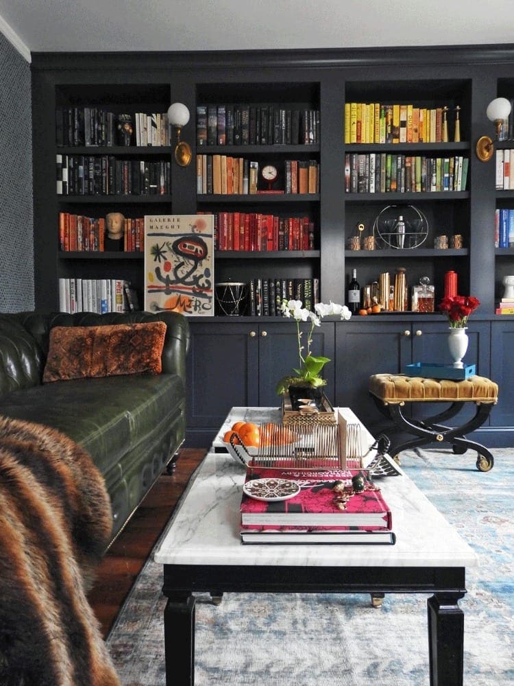
Natasha’s beautiful library was chosen by not one, but BOTH media partners. Minimalist design and neutral interiors typically catch my eye, but this well-appointed and richly decorated room drew me in immediately. I am a big fan of all of the dramatic details, especially that green leather Chesterfield, and give me all the color-coordinated bookshelves, please.
(Side note: If anyone has a line on a similar footstool, shoot me a message. I think it would fit right in here at BHH. Meanwhile, I will be scouring Craigslist.)
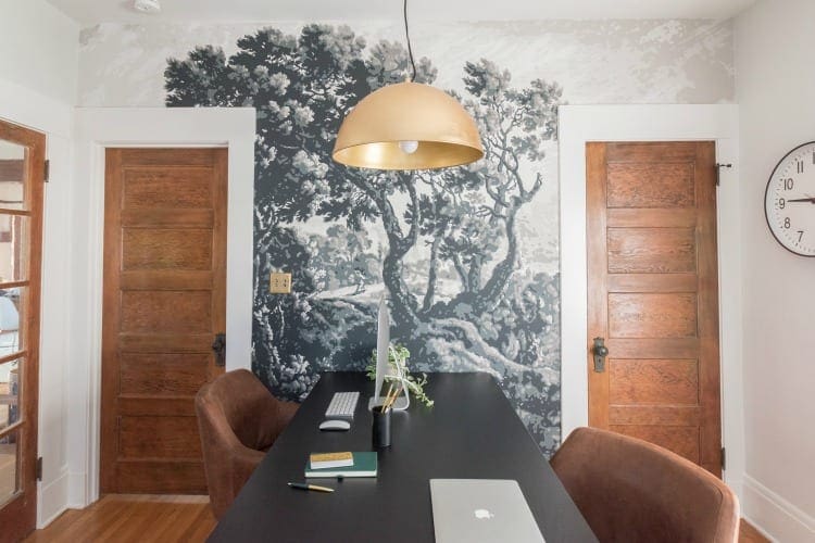
Media partner, House Beautiful intended to choose just one guest participant, but the talent pool made that idea problematic. Instead, they modified their plan and chose Ashley’s updated office too. Like Natasha, Ashley, from The Gold Hive, will be one of the featured designers during the spring 2018 One Room Challenge.
Ashley’s bungalow had excellent bones already, but she is a creative wonder. Take a look at this mural that she painted by hand. She documented the entire process on her blog, and it is fascinating.
Here are a few other rooms that I enjoyed:
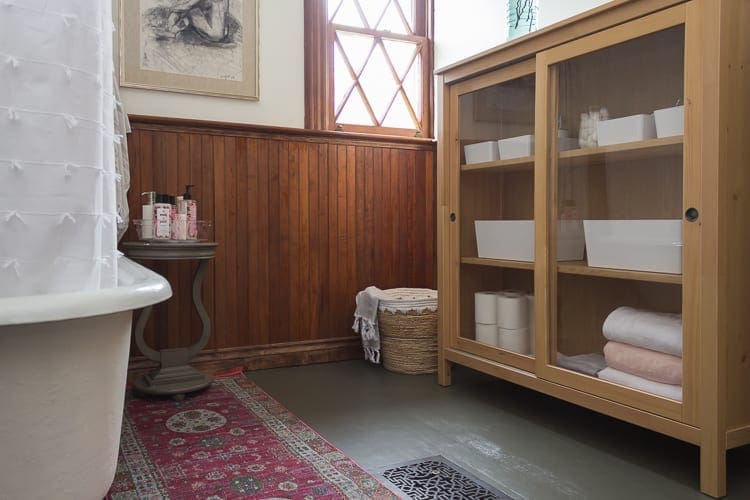
The Grit & Polish
Cathy and Garrett fix up old homes in the state of Washington. For this challenge, they chose a room in what they refer to as The Porch House.
Fun fact: HGTV filmed a pilot with Cathy and Garrett in the Porch House. It should be airing soon. I’ll keep you posted.
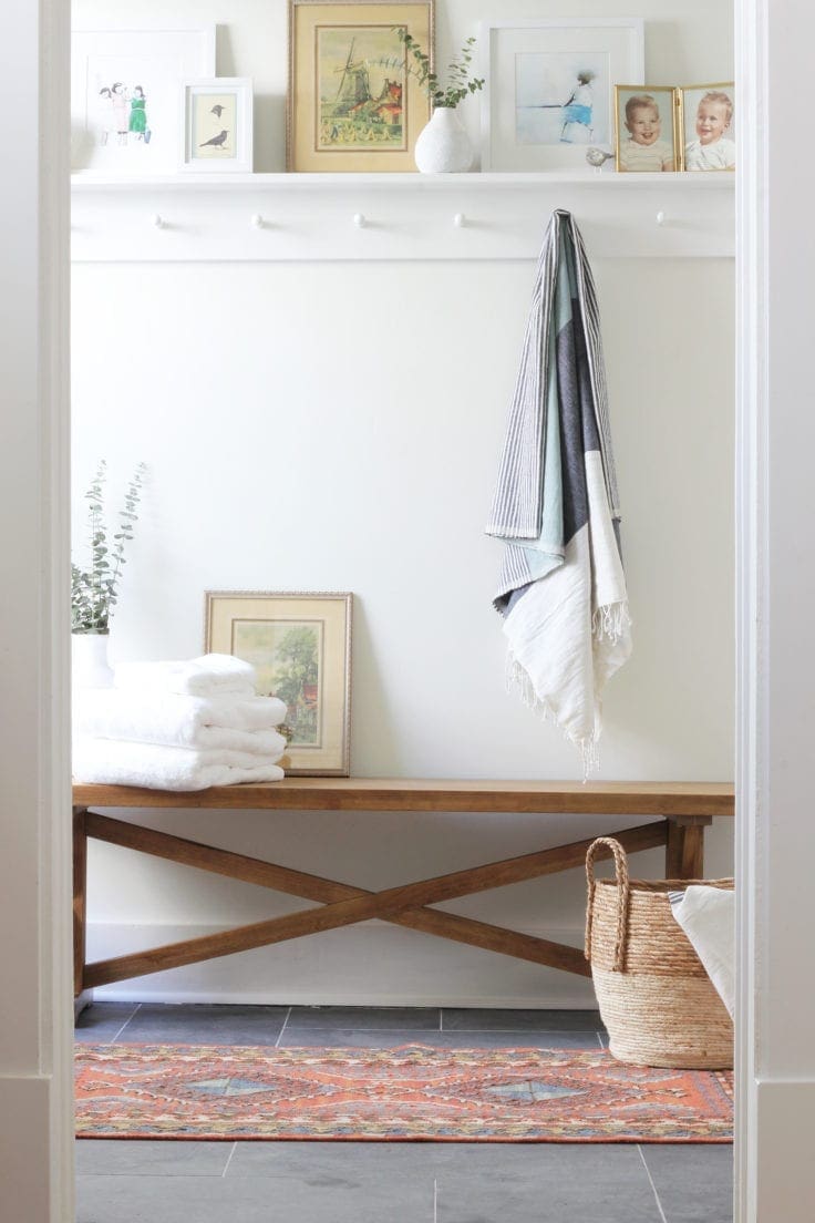
After reconfiguring the first floor to include a master suite, they gutted the bathroom and created a fresh new powder room and a spacious walk-in closet.
Cathy’s clean design choices always appeal to me. They are minimalist, intentional, and her styling is never over-the-top. She makes it look effortless.
Megan Pflug
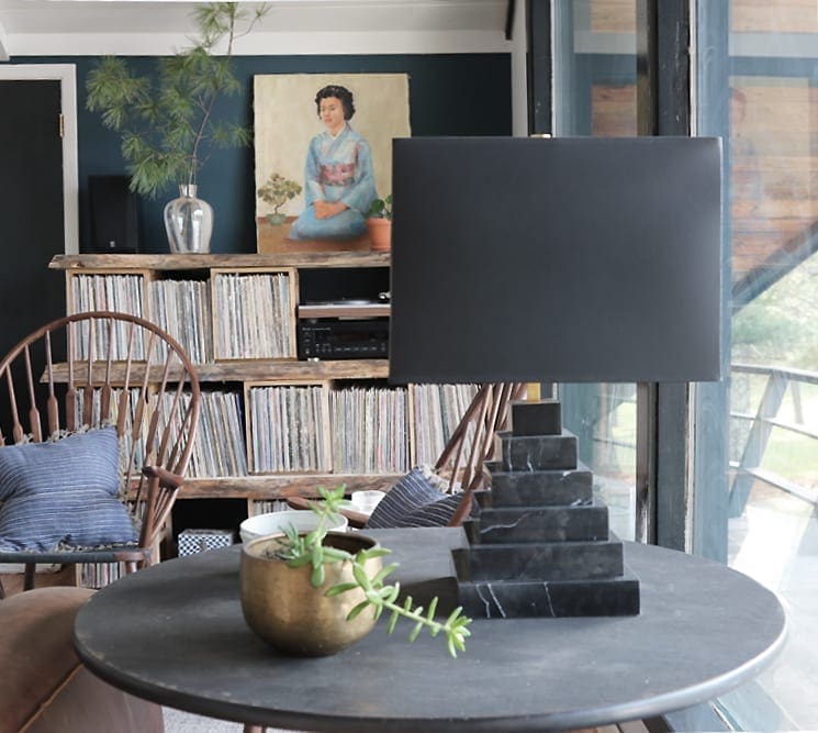
Last fall, I fell in love with Megan’s guest suite, and no surprise, I love the living space she redesigned this time around too.
I cannot put my finger on precisely what delights me about Megan’s choices. I think it is the mix of polished pieces paired with unexpected rustic elements. Her rooms always look well-appointed, but I wouldn’t feel out of place flopping down on her sofa and putting my feet up on the coffee table. (Don’t panic, folks. I promise I would never do that in a stranger’s home.)
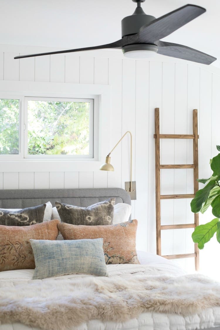
Brittany Makes – A Neutral Stunner
As I mentioned before, I am a big fan of neutrals. Brittany created perfection with her bedroom redo.
Neutrals can quickly come across as ho-hum, but Brittany is a featured designer for a reason. She knows what she is doing. In addition to being a talented interior designer, she operates the Vintage Rug Shop.
Lest you think my eyes are only capable of appreciating monochromatic hues, here are a few more colorful links:
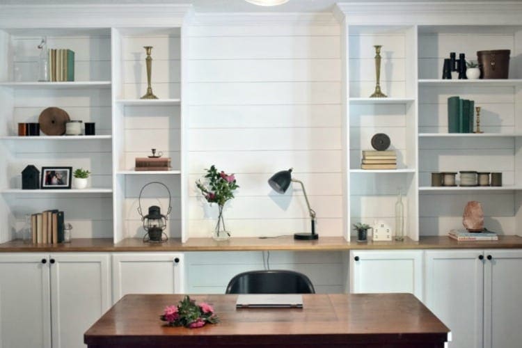
Live Love House
Last, but not least, I want to give a shout-out to Kalila from Live Love House. This One Room Challenge was her first, and she built a freaking built-in cabinet and bookshelf. There was no phoning it in for her. Kalila met this challenge head-on.
I am not super in-the-know about design since I self-identify as more of a builder/destroyer. However, I know what I like when I see it. Did you follow the ORC? Which rooms were your favorites? What do you think about neutrals vs. color? I would love to know.


6 Comments
Ame Jo Hughes
Library goals, bruh. It feels like mine is light years from being there, but eventually it’s gonna happen.
And you know exactly how I feel about neutrals and color, hahaha!
So many great projects in the ORC. Yours is totally my favorite, though. The whole package can’t be beat, and the individual elements are so freaking awesome (love the ceiling and the floor in particular).
Stacy
I thought of you while I was writing this post. I knew you would prefer the colors. 🙂 Did you see Natalie’s stairs that I linked? They are gradients of coral as they ascend!
Thank you for your kind comments about the breakfast nook. I am still so happy with how it turned out. <3
Ame Jo Hughes
Yes, I did! And I LOOOOOVE them! It doesn’t hurt that it’s a plant happy space, either 😉
Devyn
The library is gorgeous! As is the hand painted mural. Lots to be inspired by.
I am planning on incorporating a library at one end of our parlor. But I want enclosed shelves behind glass doors because I am tired of dusting books. 😛
Stacy
We have beautiful built-in shelves in the living room, and there is evidence that they once had doors. I looked for them in the basement, but unfortunately, they were not there. 🙁 I am not a big fan of dusting either. https://www.blakehillhouse.com/wp-admin/edit-comments.php#comments-form
Ame Jo Hughes
Our house has several built ins, and they also have evidence of doors – but sadly they’ve all been removed. I also don’t like to dust, and wish they all still had doors!