Today’s post is a continuation of the 2017 House Tour. We are celebrating our three-year home and blogiversary by giving our readers an updated tour of BHH. If you search House Tour on the sidebar, additional 2017 posts and tour posts from previous years will pop up.
Right this very minute, I am sitting in a Starbucks in Los Angeles writing this post. I am here dropping off our oldest at college. He is attending orientation today, and I am heading to The Getty. Thus far, I have not cried any tears. That seems like a small victory. Oh, who am I kidding? There will be a tear or two when I finally leave him here for good tomorrow morning. Right now, I am riding the wave of too much coffee and working hard to get everything done before I leave.
The Evolution of The Guest Room
Last spring, I started a series of posts about the guest room refresh. I intended to post a big reveal, but instead, I stalled on the last few details, and the project remained dead In the water for a few months. (additional guest room posts)
The guest room has been evolving since we moved into BHH. As much as I would like to say that it is finished, I am just not sure. I have more ideas running through my head, and I am not 100% sold on the paint color that I chose.
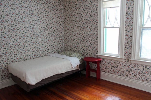
Let’s take a brief look back in time. When we first moved in, the guest room looked more like the guest room in an abbey than a room in a family home. At this stage, the only thing missing was a small kneeling rug for morning and evening prayers.
It may surprise you, but I am not a nun, and BHH is not a cloister.
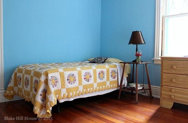
Our second attempt at sprucing up this room ended in 2015. That endeavor was fraught with miscommunication between Andy and me, a shrinking time table, and a lack of money. The result was a cross between cottage style and Andy’s childhood bedroom. (Take note of the dresser. It received a drastic makeover.)
Eventually, we added a second twin-sized bed, but the room stayed in decorating purgatory until I was ready to tackle it again. Inspiration eventually did strike this spring, but I managed to drag out the project all the way through summer.
The Current Guest Room
This post contains affiliate links
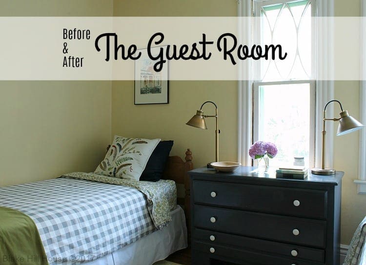
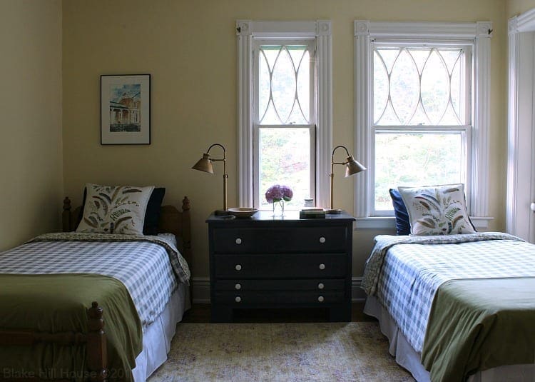
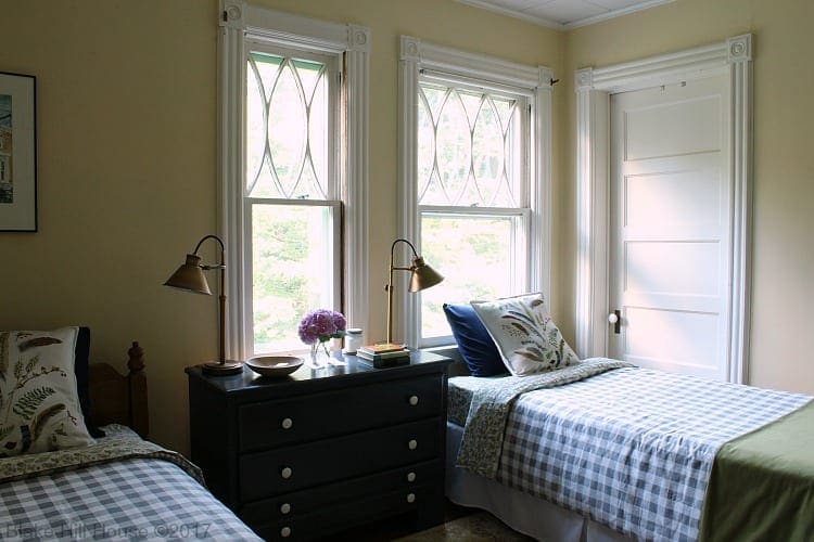
Today, the guest room looks much more pulled together. Matching bedding made all the difference in the world.
I am still searching for the perfect plush and nubby throws for the end of the beds. The sticking point thus far has been the price. I have been searching all the discount stores, but I have not found what I am looking for yet. I guess I am not exactly sure what I want, but I think I will know it when I see it.
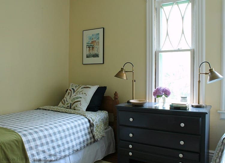
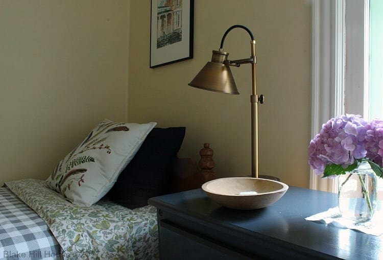
After we reoriented the beds side-by-side, I painted the original dresser with some leftover porch paint in our favorite Hale Navy color. I also added new white porcelain knobs.
I added two brass reading lamps since the only source of light in the room is one wall sconce on the opposite wall. This room also does not have a light switch. The sconce must be turned on with a knob directly on the fixture.
(Somehow, I missed taking a picture of the sconce for this post. Since I am not home, I will have to snap a picture later.)
The other side of this room is still a little sparsely decorated, but in a room this small there is not enough space for too many things. The approximate dimensions of the guest bedroom are 11′ X 9′.
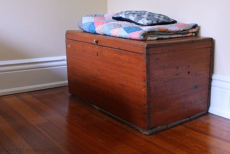
The chest is a piece that I picked up over twenty-five years ago. The quilt is vintage. I believe my grandmother and great-grandmother made it. That tiny pillow was once a coverlet on my grandpa’s bed, probably when he was a child. The entire coverlet was tattered, so my mother took pieces of it and made small pillows for herself, my sister, and me.
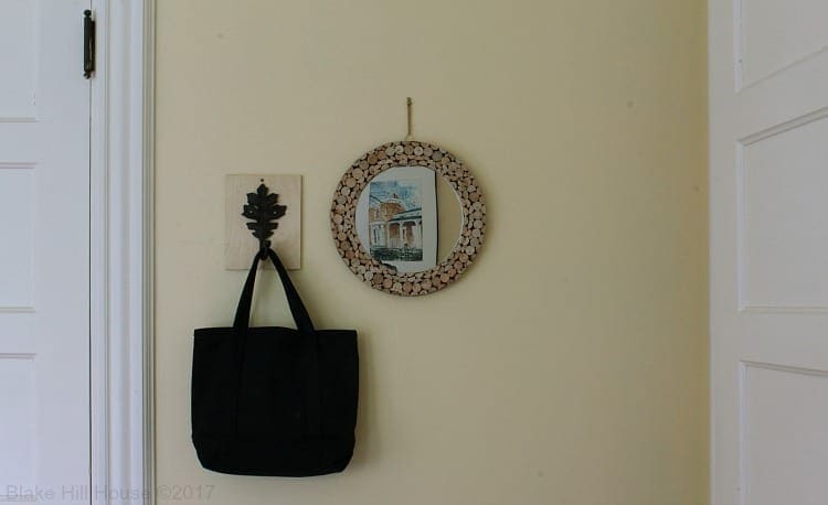
On the opposite side of that wall, I hung a small mirror and an iron hook for a purse or jacket. The reflection in the mirror is a sweet watercolor that I found for $4.99 at a local thrift shop. The painting is the porch of an old house. Pretty perfect for BHH.
I am still looking for a little something to hang on the other side of the mirror to balance it out. The door on the right is a small closet.
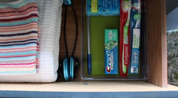
A guest room is a little different than a regular bedroom, so I added a few amenities in the dresser.
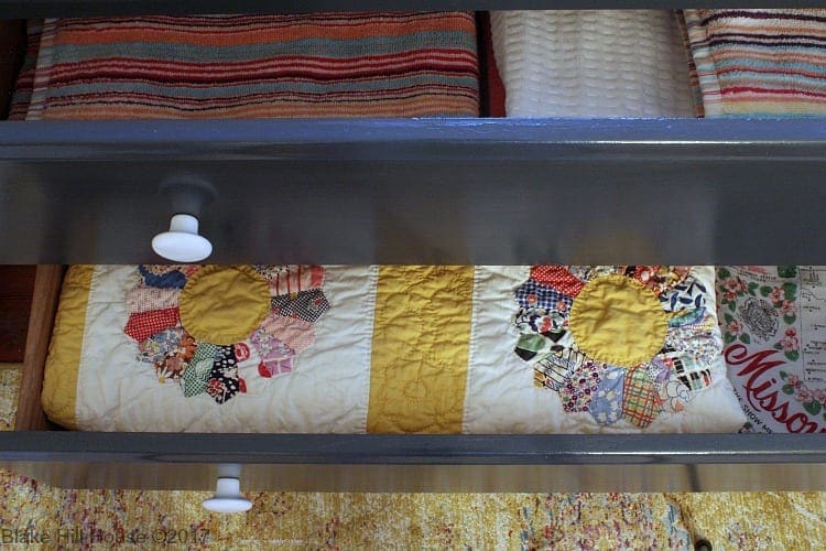
I tucked another vintage quilt in the second drawer.
Overall, what we did this time is a vast improvement over the previous attempts at sprucing up the guest room. However, I am not entirely thrilled with the room as it is today. I have mentioned before that I am not fond of the paint color. Yellow is my mom’s favorite color though, and she is probably our most frequent guest.
The blue dresser and the bedding are my favorite details. I would like to add more warm wood accents, perhaps repaint the walls, and find the perfect throws for the end of the beds.
I am open to your ideas and suggestions. Is there anything you love about this room? What would you add or change?
Sources: Bedding / Brass Lamps / Botanical Throw Pillows / Wood Slice Mirror /


25 Comments
Andrea
1) Just the other day I was remembering the big lump in my throat as we dropped each child off at college…that moment when you give them a final hug, turn away with tears in your eyes, and hope to God that you crammed in enough love and training during the years they were under the family roof. And then there’s the shifting and settling that goes on at home, as the family is rebalanced to accommodate the departure of a beloved member. It all works out, but what a time of change it is.
2) I had forgotten that WOWZA blue paint, and the hilarious story of how your husband picked it out in five minutes right before the store closed! I must say that I like the yellow better, and how nice it is that it won’t be hard to change if the perfect, perfect color ever presents itself to your imagination.
3) Those pillows turned out so well!
4) The overall effect is so peaceful, calm, and welcoming…exactly what I think a guest room should be!
Stacy
1. It was pretty hard. I keep thinking of things I should have told him or taught him. 🙂 I know he’ll find his way, though.
2. I love the way you described that color. I shall think of that blue as WOWZA Blue from now on. LOL And yes, Andy is definitely a quick decision maker.
3. Thank you!
4. I appreciate your comments. I am glad you like the room.
Chad
Having a drawer for toiletries is a nice idea. I think I’ll steal it because my roommate should be out this week and then I’ll have a guest room. And the dresser in there has cutlery dividers in one drawer and I was never sure what to do with that space after my efforts to pull them out failed. I think a stack of transit tokens also belongs in there (while I can still get them – SEPTA is finally introducing contactless fare cards, but I think those are less handy for guests)
One question – do you have nothing on the windows to darken the room?
And you and your son will both be fine!
Stacy
Great idea to add transit tokens too, Chad.
I bought pull down blackout shades to put on the windows. I am working on the side jambs, so I have not put them up yet.
Ame Jo Hughes
My oldest kid is a senior. My time is coming, and I am dreading it like a root canal. In the meantime, I’m sending you strength and hugs.
Now, onto the guest room. I, personally, love it, even though the walls are only one step up from being white. 😉 In all seriousness, the only thing I’d change would be along the line of where Chad’s going up there ^. I need windows covered when I sleep. I know you’re not a fan of covering windows, so I have no suggestions there – except maybe a rod or treatment that’s bigger than the windows, so that when one is awake, the entire window can be exposed? (An entirely exposed window is important to me – but only when I’m awake. While awake, I need as much sun and sky as possible.)
The dresser! What an improvement! Hale Navy really is gorgeous.
Stacy
I cannot believe your oldest will graduate after this year! How did our kids get so old especially since we have not aged a bit? 😀
I answered on Chad’s comment, but I do have blackout shades to put on the windows. Right now, I am working on the side jambs, so I have not installed them yet.
Vanessa
Very nice. Continuing the window covering discussion . . I vote not to do it, those windows are beautiful! Also, in disagreement with you, I love that color on the walls, a sandy yellow, I call it. I have used it often and will probably use it again at some point, although it’s not in our current house.
Stacy
I just love the windows. I will be putting blackout shades that pull down, but I’m working on the side jambs right now.
Thanks for weighing in about the yellow. I wonder if I will like it better once there are more wood accessories in the room. I might also like it a lot during the winter. It is such a warm color.
Deb Cochran-yoder
Maybe a small decorative shelf on the wall where the hook and frame are. Light. ,airy window scarf that stretches across both windows? Not a big fan of yellow either but I really like the color on your walls. Love the navy blue dresser!!
Stacy
Deb, would you put the shelf under the whole thing, or are you picturing a shelf small enough to fit on the other side of the mirror and hook? I like the idea.
Thanks for weighing in about the yellow walls and the navy blue dresser.
Julia at Home on 129 Acres
I love the lights on the nightstand. I’m normally iffy about yellow (my Mom kinda OD’d on it at her house), but I really like the soft buttery tone you chose. Can you pull out that yellow quilt that was originally on the bed? I feel like it would go very well with the rest of the space. I wonder about displaying it on the trunk or maybe even displaying it on the wall?
Stacy
Thank you, Julia. The yellow in the quilt is kind of a competing shade of yellow next to the walls, but I will take another look. I just picked up another old quilt from my mom. I think it might look great in the room. In fact, instead of throws, mismatched vintage quilts might look even better. I will give it a try.
SH
The guest room looks so inviting now, especially compared with the before and the before-before (oh how sad that first version looks). The brass lamps on the navy dresser = nice touch. Some art work over the chest might help with the sparse feeling. Something large: a framed print, a canvas, or sculptural type item (tapestry, huge basket, etc) With the cozy-throw season upon us now, new throws may be easier to find in what you want. Then see how the paint color works, it could grow on you over the winter. Has your mom seen it yet?
Stacy
Thank you, SH. I like your ideas. I have a nondescript picture above the chest, but I like your idea of something with more texture. I will keep my eyes open.
My mom stayed in the guest room in May, and she loved it. She thought the yellow was really pretty. I knew she would. LOL
Jeri
I love the walls! It may be that the improvement from the blue is so drastic but the yellow is warm and yet cheery and inviting at the same time. I think once you add the details you mentioned, you will feel that the room is complete without repainting.
Stacy
I hope so, Jeri. I don’t relish the idea of repainting. It seems like a poor use of time considering how many other things there are on BHH’s to-do list. 🙂
jenny
I love the brass lamps and the color of the dresser. I also really like the buttery yellow–I tried to find a similar shade for our guest room/office, but had the worst time finding a yellow that didn’t go too bright or disappear completely.
Is there a reason why the bed to the left of the windows has a headboard and the bed in front of the windows doesn’t? My instinct would be to switch the two, so that anyone in the righthand bed doesn’t end up leaning on the window by mistake (and to help block the cold air that might seep through the window). Although I suppose you might not want to block the view of the window frame. Hmm.
Stacy
Thank you, Jenny! If you are interested, the color is Captivating Cream by Sherwin Williams.
You ask a good question about the beds. I’m not sure why I did that. I guess I thought the headboard covering the window might look kind of strange. Maybe I am wrong. Originally, I wanted to find matching antique Jenny Lind spool beds. They are much lower to the ground than regular twin beds with a box spring. The headboard would not cover much of the window either. I am still thinking about it. Most of our guests need a higher bed, so that might not be the best option.
Devyn
Aside from that fact that I have always found the word nubby such a delightfully odd word, succinct, yet playful, I think you have made quite a nice place for your guests to stay. Comfortable, but not too comfortable as you want them to remain guests.
I really like the Hale Navy dresser. It is always awesome to borrow left over paint from one project and use elsewhere in the house, it is as if you are subconsciously connecting the two items, even if they are unrelated. The warm fuzzies (another fun word) from arriving to the house and seeing the beautiful color on the outside, mysteriously carry into the room where guests will be staying. I also like the brass lamps.
What are your plans for window coverings? It would seem that morning light would make for an early start.
Stacy
Thank you, Devyn. We have an informal collection of words in our house. We like to take note of interesting words and use them whenever possible. Nubby fits our criteria. 🙂
I always feel so good when I use leftover products from one project to another. Also, I get a huge sense of satisfaction when I use up something completely. I sense you might feel the same way.
I have pull-down blackout shades for the windows. However, I am working on the side jambs, so I have not installed them yet.
Betsy
I really like the color scheme of this room and the painted dresser came out beautiful! I think the only changes I would make, and I am no designer…is to center the bed with the headboard on the wall, center the dresser with the little window and maybe get a bigger picture or a grouping of pictures. I think the windows are just beautiful in this room, and would be so torn on covering them, but I realize uncovered windows can be unnerving to people, but that might shorten their stay too…lol
Stacy
Thank you, Betsy. I will think about your suggestions and take a closer look at the room.
Berry
I think I am the only person out there who really loved the blue walls. They were glorious and cheerful. If you don’t like your straw yellow walls, I’d pick another coordinating color from the napkin pillows. https://www.blakehillhouse.com/guest-room-details/
A deep shade of green from the fern (like the bedding but deeper) or, dare I say it, the robin’s egg blue in the bottom corner. 🙂 Pale grey would also be a nice neutral. I don’t know how much longer grey will be in style for homes, but it would look nice for now.
Things I would add: I sleep better with air movement, so I would add a lovely vintage style fan. Since this is a guest bedroom, I would add either a very discreet but easily accessible set of outlets for charging phones/tablets/laptops, or I would make a charging station. I also have a cute tiny framed “Welcome” printout for our guests with our network ID & password, home phone, address, and directions to extra spare blankets and pillows.
It’s way too early for this for you, but I also keep a basket under the bed with children’s toys and books for my nephews and niece.
Stacy
Thank you for your great feedback! You have so many good ideas. I love the idea of a vintage fan. I actually do keep a fan and space heater in the closet. A vintage fan would be so much cuter, though.