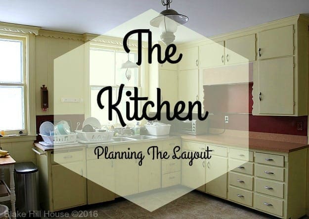
For our first meeting with the Lowe’s kitchen design team, Andy and I had to bring measurements of our kitchen and our wishlist for the project. We met with our project manager, Janet, and Karen, the team member who would translate our wishlist into their computer program in order to create the layout of our new kitchen.
Andy and I felt that our wishlist was pretty reasonable. Working in a kitchen without many modern amenities has given us a pretty modest list of wants:
- Dishwasher
- Garbage disposal
- In-cabinet garbage can
- Under-cabinet lighting
- Functioning kitchen triangle workspace
- More overhead lighting
- Lots of drawers
- A kitchen island with only prep space – no appliances
As we spoke about what we wanted, Karen created a proper kitchen work triangle based on industry standards. Then, she plugged in different cabinet combinations to accommodate our needs. During this part of the meeting, Janet asked about our budget. Andy and I looked at each other uncomfortably. We were kind of afraid that once they knew our budget, the laughing would begin. It turns out that our budget was reasonable for what we were trying to achieve.
It is worth noting that Andy and I did not necessarily know exactly what we wanted until we started to see things that we definitely did not want. For instance, Karen initially plugged in corner cabinet doors that look like a 90-degree angle but open together as an L-shape to reveal a deep corner cabinet. The intent is to utilize the dead space created by the two corner cabinets, but I knew immediately that I did not want that on the top cabinets. I did not like the way the door looked or how it opened. Another design feature that we determined that we did not want in our kitchen was a microwave/fan combo over the oven. Venting will be problematic in our old house, but we wanted to hold out for a creative solution.
The design process went pretty smoothly. Several times I had to assert that I did not want any appliances in the island. I wanted the space solely for prep. Because our kitchen has four doors, wall space is at a premium. The island would have been a reasonable place for a cooktop or dishwasher, but I stood firm. Karen was a whiz with the computer, and Janet did a good job of helping us continue to assert our wants and needs. Andy and I were assured that we could change our minds at any time, but having a basic layout was the first step.
At this point in the process, I cared almost entirely about function over form. I thought that I wanted some exposed brick in the kitchen and a quartz countertop that looked like marble. The only detail Andy and I were sure of was that we wanted solid wood Shaker style cabinets to coordinate with the original cabinets in our pantry.
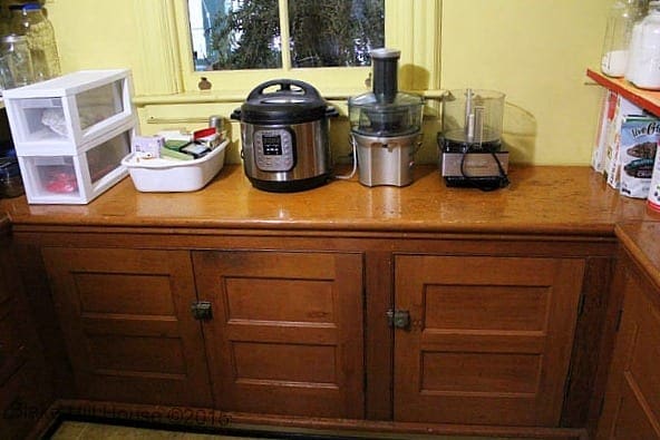
BHH is not a Craftsman style house, but the Shaker style was quite common around the turn of the 20th century. The lines are clean and classic. The cabinets we chose are made by KraftMaid.
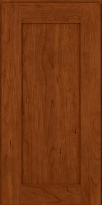
(image credit)
Once we were done designing our potential kitchen, we walked around Lowe’s with Janet to make some decisions about finishes. By this time, we had been in the meeting for over two hours. Andy was completely done, and I was wearing out too. I found myself agreeing to finishes just to have something to put in the plan. As we walked around Lowe’s, looking at appliances, faucets, lighting, countertop materials, etc…, I finally hit a wall. When we got to flooring, I realized that I did not see anything that would go with the kitchen cabinets that we had chosen. Wood looked too dark. The tile looked too builder-basic. All of our choices, from cabinets to lighting, started to feel wrong. I was falling into “people pleaser” mode and not making decisions based on what I really wanted. I do not like modern tile, but we put grey slate tile in our plan, and we all decided to end the meeting at that time.
Before we left, we received a preliminary estimate. It was near our target budget. So far, so good. We also set up a site visit. Janet would be coming to our house to get exact measurements of the kitchen. She would also be bringing the contractor to our house to determine the scope of the work so we could nail down a more accurate estimate for the project. The basic layout of our new kitchen based on their rendering looked like this (Note: The rendering does not show the gray slate tile floor.):
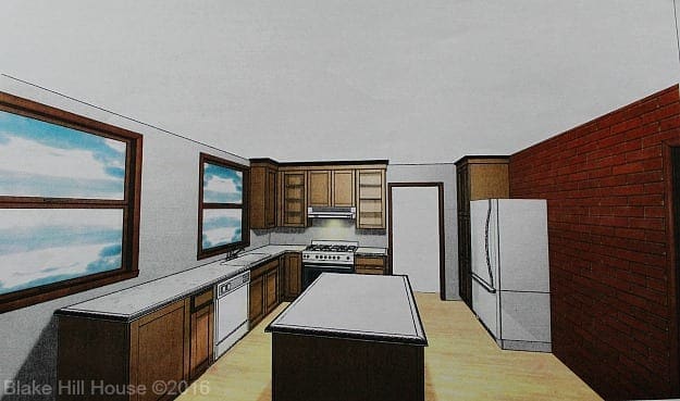
When we left Lowe’s, Andy and I were both feeling excited about the project, but I was not feeling excitement about our design or the finishes we had chosen. It had everything we needed, but it was not a very exciting plan. Andy sensed that something was wrong. I admitted that I was hung up on the flooring. It just wasn’t right.
Prior to our meeting, I visited a number of tile stores and looked at tile online. I had sensed that wood floors with wood cabinets would make the kitchen look way too dark. In addition, I had a problem with marrying a new wood floor with the original wood floors if we extended the new flooring through the hall and into the butler’s pantry.
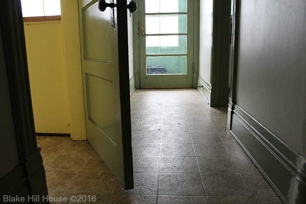
I had been drawn to the reproduction vintage tiles from American Restoration. However, elaborate tiling would be out of our price range, and the only acceptable substitute I could come up with was wood flooring. I could not reconcile large modern slate tile with the aesthetic we were trying to achieve. It was not right. It would not work.
With our rendering in hand, I looked around our current kitchen. I saw the mistakes we had made with our layout plan and where the design fell short. It was not Janet or Karen’s fault. They did exactly what we asked of them. It was me. I had compromised when I did not want to, and I had been completely unreasonable about issues that were trivial or actually necessary for a balanced design. This kitchen was not what I wanted, and it did not look good. It did not match the picture I had in my head of how this happy room should look. Now, I had to tell Andy. I was not sure what he would think or how we would proceed from here. Something, or maybe everything about our plan needed to change.


11 Comments
Gayle
Good for you!! When spending this much time and effort your very wise to revisit the plan early and often to be sure it meets with not just your needs but also your vision. I love the Houzz ap for ideas, being able to just thumb through pictures to get ideas and see what’s available is really helpful to me. I’m looking forward to your revisions!
Stacy
I have perused Houzz. It is a great resource. That is how I found our paint for the living room. I think we have a pretty good idea about what we want the kitchen to look like, and looking at pictures on Houzz and Pinterest will hopefully help it come together. I am so glad you are following along with this Gayle. You have such great taste.
Monica
I would urge you to sit on it all until you feel it is right. That said, seeing your plan, have some counter seating of some type! The room feels very long and thin as it is – Maybe a peninsula instead of an island? Also, the stove wall looks “cramped” compared to the rest of the space, so maybe have a ceiling hood instead of an under cabinet mount? Finally, I just redid my kitchen (similar age house) and took down a wall between kitchen and dining room -I was able to have wood floors run from dining room right into kitchen – the floor guys did a great match and I can’t see where new starts and old stops, so don’t be put off by matching. I have a shaker cabinet in a similar wood tone to yours and was worried about too much wood, but it looks great. I wanted something that looked like soapstone, but soapstone is not as practical ask I like, so I ended up with a honed/leathered/antique black granite that looks great – the finish does not “shine” so it feels like it matches the age of the house….just keep looking on Houzz and Pinterest and look around your kitchen with those pictures in mind – your vision will come to you!
Stacy
Hi Monica, Thank you for all of your input. I am glad to know that you are pleased with your kitchen. It sounds wonderful. You are the second person to recommend leathered granite. I am going to make sure to visit a showroom to see what it looks like. It sounds beautiful.
The rendering is a bit misleading. The kitchen is really a square, not a long rectangle. Also, so far we have been told that we cannot use a ceiling hood because we have nowhere to vent out of the house. However, I have not given up on that idea entirely. I am still asking around to find out if it can be done or if there is a model of ceiling hood that recirculates. Our old homes need creative solutions, right? Lastly, we won’t be adding seating in the kitchen because our phase II plan includes opening up the wall to an adjacent small enclosed porch in order to make an eating nook right off the kitchen. I explained the plan in this post. We currently eat in the formal dining room.
Ame Hughes
I agree with the other comments – best to make changes now, rather than in the middle of installation.
I know you didn’t ask for flooring suggestions, but something sort of intriguing just popped into my head for the floor. I need to send you a link or a pic. There’s a house for sale a mile from me (that I *love* and if I could, I swear I’d buy it tomorrow – my youngest is the only Hughes on board with that, though, so it’s not happening), and in the foyer, they have a floor that I love but that also makes me cringe thinking about doing it. It’s a painted wood floor. As in, painted with a pattern. I’m not sure I could ever bring myself to do such a thing, but IT LOOKS SO GREAT! I’m going to find the pic for ya to take a gander at…
Stacy
I love the link you sent. I think we may actually paint the vinyl floor in the hall and butler’s pantry if we cannot afford to have new flooring throughout put in this year. It could be a good interim solution.
Julia at Home on 129 Acres
Thanks for being so open about your process. I understand the people pleaser–even when it’s for you!
I was going to suggest a painted wood floor as well. Are there tiles or linoleum that would be appropriate for BHH? And your budget?
And I’m with you on the island. My favourite part of my island is that it’s just an island. No sink, no cooktop. Nothing to interrupt the space. I do think I could maybe handle a dishwasher or some other undercounter applicance… maybe.
Stacy
I thought of you when I wrote this post. You had asked about how we determined the layout. The general layout was pretty easy thanks to Lowes. The specifics could change on a daily basis if we overthink them. 😀 I will look at painted floors. For me, there are not too many tiles (except vintage replica) or linoleum that would really work in BHH. Well, that’s not true. I could use anything, but I admit to being very particular since I am trying to work with the rest of the house too.
Jamie
Stacy, I’m sorry the planning process didn’t go as smoothly as it could have. I’ve never taken on a project as large as gutting and rebuilding a kitchen, so I don’t have much helpful advice to offer. But I think it’s great that you realized where you had gone astray while still in the planning stages, when there is plenty of time for a course correction. I really appreciate these posts…with home improvement projects, it’s so helpful and interesting to be able to follow the process from start to finish, because we all know it doesn’t happen in 30 minutes or 3 days like certain TV shows would have us believe 🙂
Stacy
Thanks, Jamie. The process has been about as messy as I expected. The investment is huge, and it feels like a great responsibility. I’m trying to really break it down write about the ups and downs so people will understand exactly what you mentioned: These projects don’t happen in 30 minutes or over a weekend. 🙂 As Andy keeps reminding me, “We will have our new kitchen. Just be patient.”
Vanessa
I am working on a little kitchen just now for a small house I plan to sell. It wasn’t until I pulled the trigger and had the meeting (at Home Depot), made the choices, etc, that I could actually start making better decisions. It seems like a lot to ask for all that time and effort from a vendor but I don’t see another way to do it.