Today’s post is going to be a quick one because I have a full workday planned. Andy and I celebrated our anniversary on Wednesday and Thursday. Friday was catch-up day, and now here it is Saturday, and I am two days late with this post already.
If you are reading this blog for the first time, welcome! You haven’t missed anything. You’re right on time. Before I dug into the Lopsided Living Room project completely, I was determined to finish my daughter’s bedroom makeover first. That poor girl has been waiting since pre-pandemic times. I was down to the last few details, and I am happy to report that her room is finished! She moved back in last week, and I plan to post a reveal sometime this week. Now, I can focus fully on the living room.
Inspiration Vs. Reality
This post contains affiliate links.
Last week, I shared the inspiration photo for the room. Weirdly, that feels like a month ago for some reason.

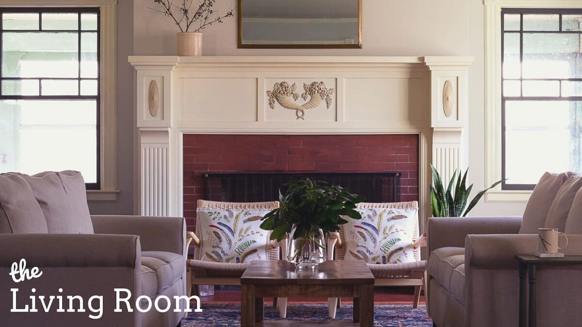
The photo is from the book A Place To Call Home by Gil Schafer III. I had a brief chat about this photo in stories, and here’s the recap. I am drawn to the light and bright feel and the deeply saturated colors in the art. However, my favorite feature is the black windows with nearly-transparent shades.
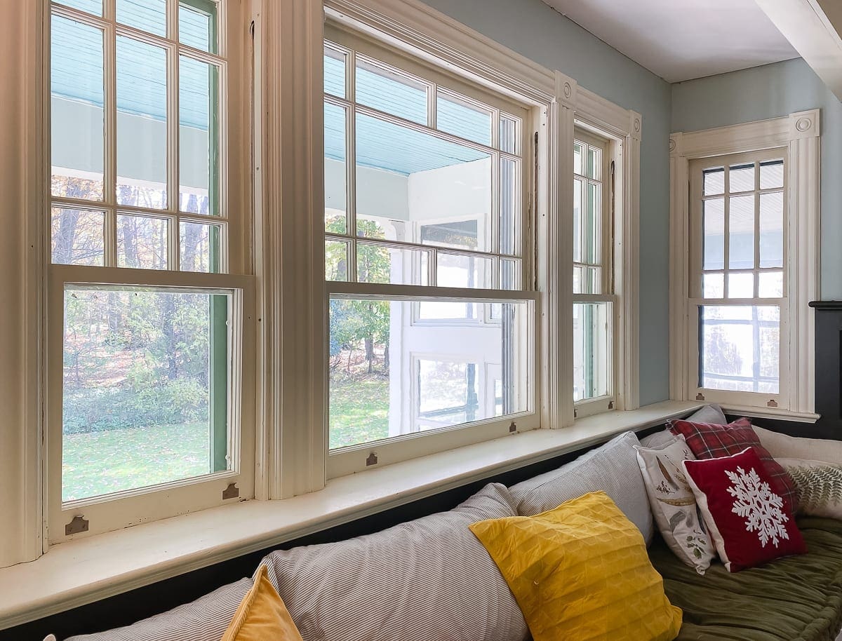
Blake Hill House has gorgeous original windows. The way the house is situated on the property and where the living room is located, shades aren’t necessary.

I know that drapes soften up a room, but I love our windows so much, and I never want to cover them. Even low-profile roller shades often look too bulky at the top. While I do not have the budget for any blinds this round, I am painting those sashes black, and they will really pop.
(Ignore the furniture placement below. We just tossed everything back in the room randomly.)

Painting the sashes black will also help both sides of the room tie together. Remember my boat analogy? Everything is still heavily weighted on the left side of the room.

About That Black Color…
A few months ago, I repaired the plaster and painted the bookshelves Black Magic by Sherwin-Williams. The faux bois colors are from Benjamin Moore.
While I love the way they look, the short story is that all of the coordinating shades of black in this room and adjacent to it lean brown. Black Magic is a rich black with no discernable undertones. The bookshelves look fine, but not great.
The long story is that when I was choosing colors, I loved Black Fox by Sherwin-Williams so much more, but I talked myself out of it. Andy liked Black Fox better too, and I told him that it wasn’t the right color for the room. Ha! The joke’s on me, and now I am repainting what I’ve already painted, and I am being super sneaky about it. Andy and I will laugh about this someday, but for now, I’m going to paint them Black Fox stealthily and pretend they were that way all along.

Someone asked me this week to tell them the secret to a long-lasting marriage. It’s being sneaky and not admitting when you’re wrong. No, wait! That’s not right–honesty–100% honesty!
Speaking of being stealthy, though, I have to run and start that painting. Andy will be home in an hour and a half.
Be sure and visit the One Room Challenge blog to find more inspiring projects full of complete honesty and smart people who don’t have to repaint stuff they already painted because they were stubborn and had to be right.

The featured designers are pros, and the other guest participants should be. They aren’t playing around.
Now, I’m off to paint all the things. As always, real-time updates happen on Instagram.


4 Comments
monica
So looking forward to seeing this room! I love rearranging furniture and also like to see others do it as well. Have you considered using curtains/drapes only on the big window that Andy sits in front of? If you hang them so that they just cover the wall on either side, they would not block light or view but might give weight to that side of the room. I think it would look OK to have them only on that window, given its size and lack of mullions it is different from the others, which as you said are nice as they ar. . Kind of thing that you have to try to see if it works!
Other thought is to use big and dark art (a dark tapestry or some other cloth piece, or art with dark frame and dark content) on the wall on either side of the big window to give weight there…
Love, love, love the rug!!!!!
Stacy
Thanks, Monica. I appreciate the insight about the large window and curtains. I’ll certainly consider your idea. The artwork will change for sure.
Michelle Felux
I love how much natural light you have in this room and I wouldn’t want to cover it up either! And yes, I am one of those people who would try their hardest not to have to re-paint! I hate painting, so even if I was wrong the first time I’ll try to make my room work around it hahaha!
Stacy
Thank you! Fortunately, I don’t hate painting as much as other tasks. 😀