During the past few weeks, I have been working on the main bathroom renovation plan. I had such a nightmare experience with the guest bath that my enthusiasm for another bathroom remodel was at an all-time low for a long time. However, much like childbirth, the pain faded, and Andy and I decided it would be better to move forward to make the main bathroom functional and beautiful before we sell BHH.
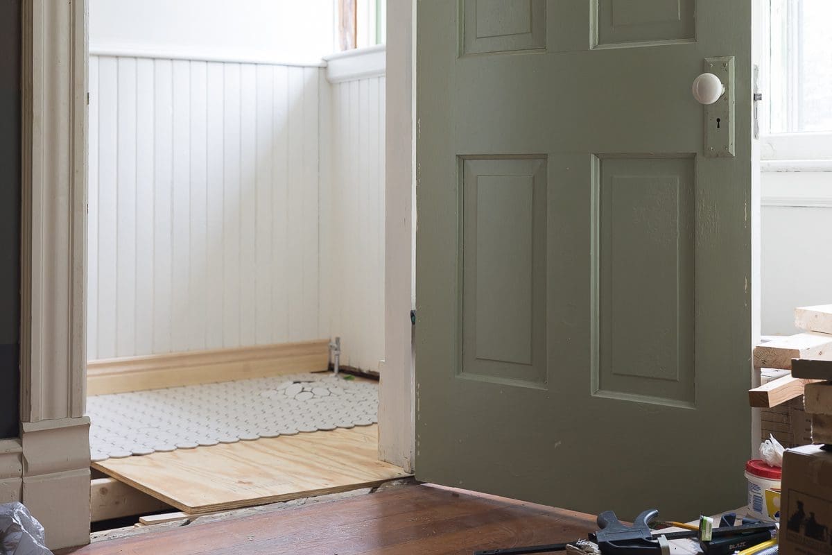
It might surprise you to know that I’m using a contractor again–no, not the horrible, no-good, very bad contractor from the before times. I’m getting the dream team that helped me with the guest bathroom back together. The team includes an excellent electrician, plumber, and tiler/builder, and I am on the schedule for the end of summer/early fall. As much as I would like to complete the bathroom as a DIY project (No, I would not.), my recovery from surgery prevents me from doing so (Thank goodness!).
To refresh your memory, here are a few photos of the bathroom as it looked when we moved into BHH.


In 2017, I pulled off the pink wallboard and found the original but damaged wainscoting. I likely freed a ghost living behind the toilet, and we started calling it The Scary Bathroom:


In 2018, I decided to give the bathroom a second refresh for the One Room Challenge, and this is how the bathroom looked at the end of eight weeks:


The bathroom looked very pretty, but it still wasn’t entirely functional. The clawfoot tub leaked under the drain, and it was a pain to get ready in front of the sink without a countertop. Also, since 2018, the rug has mildewed, the tub-side table is going to break any second, and the painted floor hasn’t held up at all.
What We’re Keeping
Before I explain the plan, I want to clarify what we are keeping. The photos make everything look wonderful when the truth is something else entirely.
- The wainscoting stays, and it will remain brown. I’ll sand it a bit and refinish it with tung oil.
- I swapped out the toilet a couple of years ago, and we are keeping it too.
- The leaky tub has to go, but I saved the clawfoot tub from the guest bath, and we’ll use it instead.
The New Floor Plan
The nice thing about this bathroom remodel is that I don’t feel obligated to make it look a specific way. BHH didn’t even have regular bathrooms when it was built. The main bathroom seems to have been put in closer to 1920, and the half-bath downstairs was probably added around the same time. The guest bath tracks with a 1930s update, and finally, there was a mid-century plumbing upgrade.
Since the options are open, I am changing the floor plan and going for a classic/timeless design overall.
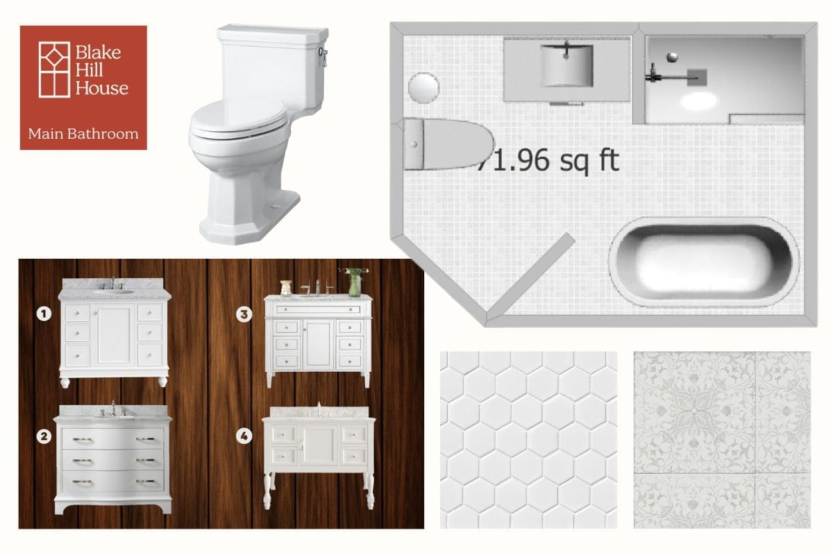
Keep in mind that I am terrible at drawing floorplans. The plan below is to scale for the most part, but it was difficult to make everything exact.

I am going to talk to the plumber because my preference would be to swap the vanity and the toilet, but I don’t want to spend a lot of money on that. If I move the vanity, I will also have to pay for new electrical wiring. Once I talk to the crew, I’ll make a decision, but I am moving forward based on keeping the toilet where it is.
The tub will move to the opposite side of the room where we currently have a free-standing cabinet.

The new shower will be a custom size of approximately 30 X 48 inches. The smaller shower will leave room for a full 42-inch vanity, and I would love to have you help me choose which one.
Vanity Options – 42″
As you look at the options below, feel free to ignore the handles and knobs. There is a good chance I’ll change those. All four vanities have solid wood components, and the tops are Carerra marble. The marble will match the shower sill and the door threshold and pull the design together.
Which one is your favorite against the natural wood wainscoting?

- 1) lots of drawers – round feet
- 2) simple front – backsplash included
- 3) busy front – square legs
- 4) open + drawers – backsplash included -An open shelf on the bottom seems to have disappeared in the image, but it exists. The shelf would be a good place for towels.
Tile Possibilities
I haven’t 100% decided on tile for the floor and shower yet, but I’m leaning towards the William Morris for the shower walls and the 2 X 2 white hex for everything for the floors, including the shower.
Fixtures and Details
Until I order the vanity, I’m not going to focus too much on the details. I do know that I want polished chrome fixtures, but lighting is still a wild card. The electrician will have to move some of the wiring to accommodate the position of the new vanity. I will likely be inspired as we are talking through those changes.
Every room in BHH is loosely themed around nature and natural elements. So, I look forward to bringing all the details together.
Please let me know what you think about the plan and the vanity choices. I’m looking forward to your feedback.


32 Comments
June Scott
Wonderful post — you found some nice vanities! I like vanity 4 the best because of its openness. Second choice is number 1.
Stacy
Thank you! I appreciate your feedback. I was very surprised about the vanity options in my price range of approximately $1000.
Southern Gal
One or three for the vanity- those are all gorgeous but drawers and a center cabinet for those tall things you always need in a bathroom
suggestion if you cant move the toilet – rehang the door to open to see the tub not the toilet.
Stacy
Thanks, E! The door actually does open to see the tub because it is on the diagonal.
Amy
Vanity 4. It looks the most charming and least stuffy/rigid, I think is suits the house better than the others. Re floor plan, can you rotate the toilet so it backs onto the vanity wall? I think it would look more organized and feel more open around the door and vanity. Then you could add a medicine cabinet over the toilet if you need storage, or art if you don’t. A nice big mirror and light over the vanity, hand towel holder on the short wall of the shower next to the vanity, bath towel holder on the window wall between the tub and shower, and a little stool can float around wherever you need it.
Stacy
Thanks for the input, Amy. As far as moving the toilet goes, a move is a move. So, if I’m going to pay for that, I’d prefer to relocate it next to the shower and get a longer vanity.
Lia
My choice would be vanity 4. I like how it high it sits off the floor and I think it will take up less visual space. I love the layout even if the toilet stays where it is, and I hope this bathroom remodel gets completed with minimal hiccups! Can’t wait to see it finished 🙂
Stacy
Thanks, Lia. I hope it goes smoothly too! I am crossing my fingers.
Lia
My choice would be vanity 4. I like how it high it sits off the floor and I think it will take up less visual space. I love the layout even if the toilet stays where it is, and I hope this bathroom remodel gets completed with minimal hiccups! Can’t wait to see it finished!
Jess
I like #1 the best for a timeless choice!
Stacy
Thanks, Jess. I really like #1 too.
Nicole
Exciting! I think vanities 1 and 4 are pretty. Can’t wait to see how it comes together!
Stacy
Thank you, Nicole. Even though I won’t be around to enjoy the bathroom for the long haul, I am still excited about getting it finished.
Design Enthusiast
Hands down number two with the handles swapped for something more classic and less bulky looking. The simple front will not compete with the verticle lines of the wainscoting, and the gentle curve will play wonderfully with the curves of the tub.
I have something like number 4 in my main bathroom and I regret it. The open shelf is too low to store anything useful and it basically just collects dust. Much better suited to a guest bath. Closed storage for the win!
Stacy
I really like #2 also. You point about #4 is really helpful! I didn’t think about the shelf being too low, and it’s also right next to the toilet. Blech…
Mary Evers
I like the simplicity of #2. But I’m hoping you can swap the location of the toilet & vanity. If so, it appears you could get a larger vanity. Maybe even one with double sinks. If not double sinks, at least a larger countertop.
Stacy
I’ll play it by ear with the toilet and vanity swap. I’ll make a decision once the floor is out and the plumber and I can review the options.
Jennifer
Great options! For the most closed storage, and in a bathroom closed storage is the most – erm – hygienic, #1 or #2. Is the top drawer functional on #2? Do you need space for tall things like toilet bowl cleaners and bathroom cleaning sprays? If yes, #1 has both tall cabinet and drawer space. Practical thinker over here.
Stacy
Thanks, Jennifer! I never thought about how close the open shelf would be to the toilet. Gross! 🙂 As for cleaners, I keep those in a supply closet a short distance away.
Golden
I’m no help because I like them all for different reasons. I was about to say think twice about towels near the toilet, but also wondered if you needed tall space for spray bottles, lysol wipes tub, toilet brush or anything else tall that folks sometimes store under sinks. Although #2 is the most modern one, I am a fan of big drawers like we see in kitchens nowadays. Very versatile. I also vote for the one that uses the footprint it takes up the most efficiently, so not the one with the shelf underneath.
So, no help. At the end of the day, I am always surprised at how much function/needs influence a purchase for a home! It’s just which one is prettiest or fits or is the best value or fits the feel/age of the home. Just the other day, a friend posted about an expensive dishwasher she recently bought….and the shape/size of her dinner plates don’t fit right in the bottom, and to bring any suspect dish with you when picking out a dishwasher.
Stacy
Thanks, Golden. I’ve definitely considered what I need to store in the bathroom. At this point, #4 is my least favorite.
Chris
My favorite is #4, but I feel that for a main bathroom #1 would be more practical. Where are you planning to store towels and TP? If it all goes in the vanity, I’d want one with more space. And to echo everyone else, I’m anti open shelving in the bathroom. Dust and microparticles, just no.
Jenny
I like #4 for pure aesthetics but can’t deny that closed storage is much better than open, especially in a bathroom. So having said that, #1 or #3 would be my pick for aesthetic+function because I feel like the decorative feet are more in keeping with a historic house and I personally prefer smaller drawers for toiletries so they don’t constantly fall over/rattle around. BUT #2 would be my pick if I needed towel storage in the actual bathroom.
Why did I even leave this comment, it’s such a mess 🙂
Stacy
haha! Thank you. I do appreciate your input, and it gives me something to think about.
Ronald
team 1 or team 4 for me, please
Stacy
Noted! 🙂
Cate
Hi — Just discovering your beautiful house and blog via Daniel Kanter. We’ve been renovating an old house for 14 years. Our bathroom is 4×6 but otherwise similar to yours with bead board, a claw-foot tub, and Marmoleum over a wood floor. Our small 19×16 sink (original to the 1895 house) is cast-iron, oval-shaped, and wall hung and has literally nowhere to put even a toothbrush. Here is how we cope, Victorian style: An exterior-mounted salvage circa 1900 medicine cabinet with mirror, a glass shelf on brackets over the sink, and wall-mounted toothbrush holder. The soap dish could also be wall mounted, or a clam shell in the sink, but ours is one of those old-fashioned baskets (purchased new) that hang on the rim of the claw foot tub. The towels hang on nickel hooks. We really enjoy our bathroom and find its original design is both convenient and attractive.
Stacy
Hi Cate, I’m sorry it took so long for me to respond to your comment. I just saw it! Welcome. 🙂 Daniel is such a fun friend. I really appreciate your input regarding storage over the sink. I’ll take a peek at what your suggesting. The good news is that the bathroom itself is pretty large. So, it can accommodate some furniture pieces that can pull double duty as storage and shelving.
Cate
While looking at images of Victorian bathrooms, I noticed they all have shelves mounted above them, as well as other holders mounted nearby. Here are some intriguing images:
https://www.brownstoner.com/architecture/victorian-bathroom-history-plumbing-brooklyn-architecture-interiors/
Keith Patterson
Wow you had your work cut out for you on this one! I think vanity #2 is the cleaners look but #3 is classic shich never goes out of style.
maria
Love this post! You’ve got a great eye for vanities. #4 is my favorite too, because the open shelving adds a light and airy feel. Kitchen Renovations #1 is a close second with its sleek design.
Stacy
Thank you!