This is the final plan. I swear it! Ok, here’s what happened. After meeting with the contractor and writing the last bathroom update post, I started having second thoughts. So I dragged everyone into the tiny bathroom and made them stand in the tub and pretend to wash their hair. Being a mom is fun. I wanted to get a sense of how the proposed size would work for a variety of people. Even though I tried to make the original plan work, it just didn’t. The shower protruded too far into the tiny bathroom, and the width was too narrow for the average adult male.
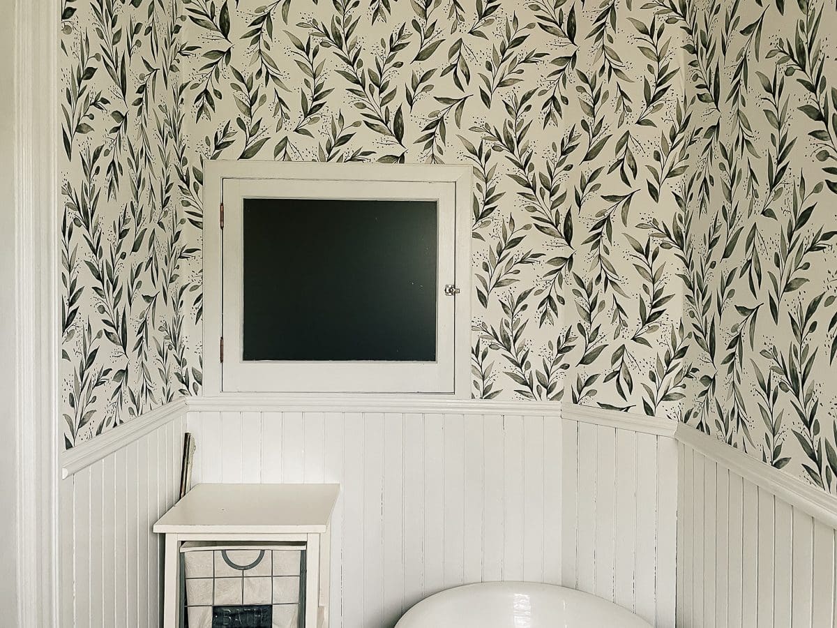
After a few restless nights and some very important polls on Instagram (lose the window? keep the window?), I called the contractor to come back to talk about taking out the window. Here is what it looks like from inside the bathroom using the fisheye, funhouse lens. The room is not this large.

And here is what the window looks like from the hall.

That gate is for the top of the back staircase. Based on the trim, this odd little window looks to be a 1930s to 1940s addition. I suspect that the bathroom was originally a closet, and there might have been a door here instead of a window.
My contractor and I talked about every scenario, and he was so nice that he kept saying, “That will work. I can do that.” He is very invested in making me happy, which is an excellent start to this whole thing. So we both squished into that tiny bathroom and measured a lot of different options. In the end, we finally landed on a decent plan that accounts for the weird wall angles, tiny footprint, and 6′ tall men. After that, Andy and I hashed it out again and simplified the shape even more.
We decided to put it at a bit of a diagonal, with the back of the shower narrower than the front.

I used my extra professional graphic arts skills to draw it for you. Enjoy!

The entire front will be glass with a glass door. There will probably be a ledge or a shelf on the back wall (left) rather than a niche. There is a light fixture on the opposite side, and I don’t want to deal with a niche between the studs. I also need to check the code because we may have to terminate that electricity regardless.
It’s a little odd, but I think it’s kind of charming. One of the things I love about old houses is seeing how people made changes for modern life. This quirky shower will become part of the BHH story.
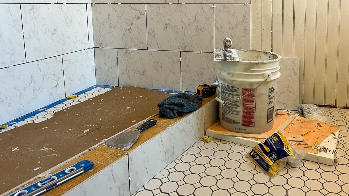
The last change is the shower wall tile. After lugging the Niro sample around, I became concerned about the weight on the walls. So, I switched to a cheaper and larger tile Cararra Gris Matte in 12″X18″. I won’t lie; It looks cheaper. I struggled with that, but it is a better option for the health of the house. It’s going to look great.
At this point, the tile is here, and the electrician will arrive next week to talk about an overall updating plan that includes both bathrooms. The contractor should start in about two weeks.
Although I expect some ups and downs with construction, I’m feeling solid about this plan.
What do you think about the changes?


6 Comments
ryan
The polygon shower looks like a good option to me. It fills in the awkward spaces and maximizes functional space. Your wall tile selection reminds me of the tile that <a href="https://manhattan-nest.com/2019/06/18/my-upstairs-bathroom-refresh-the-big-reveal/"Daniel Kanter used in his upstairs bath “temporary” update. And I was surprised as how much I liked it used there (given that I usually don’t like large format tiles).
It’s a little sad to loose the window for light in the stairwell but a functioning bathroom should take priority, especially since the window was a later modification anyway. What about a wide transom style window at the top of the wall? (similar to https://www.yellowbrickhome.com/our-small-bath-reveal/)
Stacy
Thanks, Ryan. The tiles do look very similar. I think the pattern on the ones I chose is lighter, but otherwise, yes! Daniel can do no wrong, IMO. 🙂 The transom in the Yellow Brick Home bathroom is adorable.
Barbara H.
Thinking, revising, thinking and revising multiple times means you will come out ahead in the long run, though no doubt you are just wanting it over and done. Good for you for giving yourself this time before construction starts – none of it is easy but you are much more likely to come out with something you can live well with when it is done.
Stacy
Thanks, Barbara. Although I wish I could see the ending from the beginning, I have come to realize that I’m just not that kind of person.
SH
First, I have to say that I found this post full of…wit! A couple of actual lols. It’s a clever quirky design befitting a quirky house. Besides, where is it written that showers have to be a parallelogram? The next several weeks will be a fun ride. I’m ready. Let’s do this!!!
Stacy
I’ve still got my sense of humor. It’s the only thing I can control. 🙂 I am excited to get started. Thanks for always being here.