Creating a Lighting Plan
When we met with the Lowe’s team, proper lighting was at the top of our list. As the kitchen design progressed, the lighting plan fell into place. Even though it was not period-specific to BHH, we added plenty of recessed lighting on dimmer switches to brighten up the entire room. We opted to add task lighting in two places: Above the kitchen island and over the sink. Using a classic fixture in those two places was a great way to offset the very modern feel of recessed lighting, and schoolhouse lighting was a perfect fit. It seamlessly blended the general feel of our 1800s home with the new kitchen and all of its modern amenities.
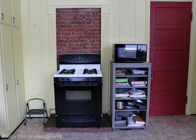
One of my chief complaints in our old kitchen was the lack of proper lighting. The kitchen had three lights. There were two task lights, but the lone hanging light in the center of the room was responsible for illuminating the entire kitchen. When I stood at the stove, the center light was behind me. My head eclipsed the light, and I found myself fumbling around trying to see what I was cooking. The lights were hopelessly out of style, and they also lacked function. I was anxious to fix this problem.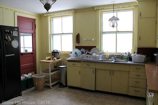
Schoolhouse Lighting
Schoolhouse lighting has been popular since the early 20th century. It was widely used in libraries, schools and other public buildings. Opaque glass shades covered traditional schoolhouse lighting, but today’s choices come in a wide variety.
I headed to a local lighting store to find ours, but I am sharing online source links with comparable pricing within this post. (affiliate links.) The lights I chose were from the Alcott collection by Feiss. Feiss has a long tradition of high quality lighting. I was drawn to the simple lines and the enclosed shades in this collection. Lightbulbs under open shades collect a lot of dust, and keeping things dust-free is not my super power. The Alcott collection contains many variations of shades (clear glass, opaque glass, seeded glass) and finishes (satin nickel, polished brass, oil-rubbed bronze).
I am not great at these types of decisions, and I waffled back and forth for a few weeks between polished brass and oil-rubbed bronze. Seriously, I could not commit. In all fairness, this was during the time when I had many kitchen decisions to make, and my brain was on overload. Finally, I settled on oil-rubbed bronze with seeded glass shades.
Our Schoolhouse Lighting in Action
We chose the largest size for above the island. When the electrician first hung the pendant, I was worried that I had chosen a fixture that was too large for the space. However, the longer it is in place, I more I like it.
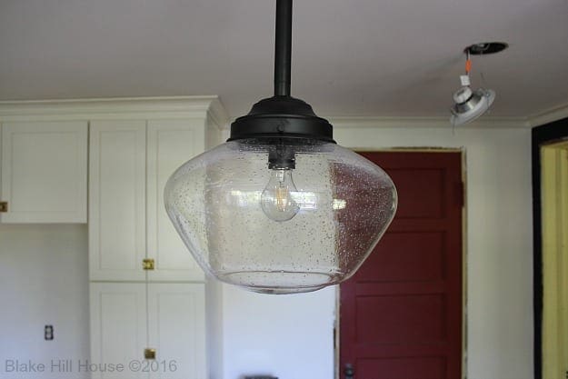
Size Large Available at Amazon
We used the smallest size over the kitchen sink. I had no second thoughts about it once it was hung. The scale was just right. (This fixture also comes in medium size.)
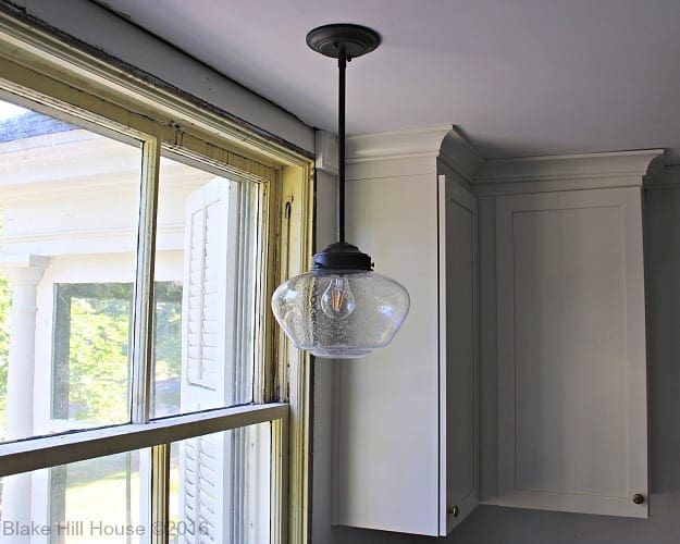
Size Small Available at Amazon
Now, our kitchen is the brightest room in the house, day or night. The electrician attached both fixtures to dimmer switches. (Note the new shelves between the windows!)
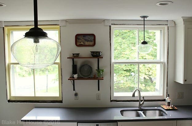
In this photo you can see both the recessed lights and the pendants in action:
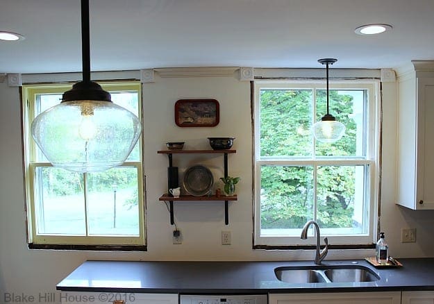
There are certain decisions that we made in this kitchen that just feel right. The classic schoolhouse lighting is one of them. The pendants, in addition to the recessed lighting solved our form and function problem beautifully. It feels like such a luxury to be able to see what we are doing no matter where we are in the kitchen.

This post contains affiliate links.
Shop our classic and energy-efficient lighting:
1. Recessed Lights (Retrofit LED downlights)
2. Large Schoolhouse Pendant by Feiss (shown above island)
3. Medium Schoolhouse Pendant by Feiss (Not shown)
4. Small Schoolhouse Pendant by Feiss (shown above sink)
5. Dimmable LED filament light bulb – This is a great alternative to the current fashion bulbs that cost a lot and do not last long. (shown in both lights)
The Entire Kitchen Remodel
If you just started reading here, you may get caught up with our entire Lowe’s kitchen project by reading these additional posts:
We are not being compensated by Lowe’s, but I am covering the entire process from concept to completion in order to help others who might be considering a Lowe’s project of their own.



6 Comments
Ame Jo
Those lights are perfect for your kitchen! And I love the open shelves between the windows.
Stacy
Thanks, Ame!
Courtney @ Foxwood Forest
Ahhhh! THE KITCHEN! Gosh, I am just loving all your updates. The schoolhouse lighting was a great choice; it’s beautiful as part of the overall design.
Stacy
Thank you, Courtney. 🙂
Stacey Keeling
Fantastic choices! You were so smart to think of lighting from the start. You’ll be much happier.
Stacy
Thanks, Stacey.