In my other post this week, I forgot to say that I hope all of my American readers had a nice Thanksgiving. We spent ours in Fort Wayne, Indiana, with the in-laws. I was so focused on The Year of the Window that I put Thanksgiving out of my head too quickly. I can be single-focused at times.
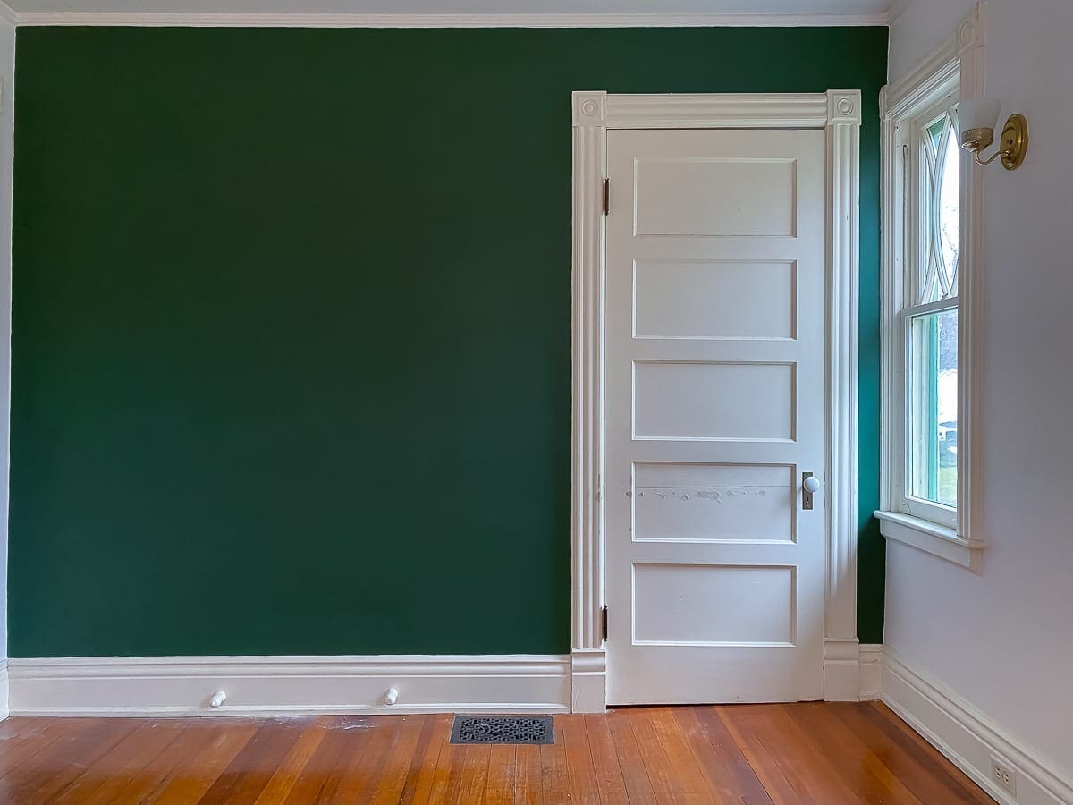
Now that we have new wallpaper in the front entry, that green paint is bothering me more than ever. The more I dislike it, the more readers seem to double down on their love for it. Even so, I enjoy that everyone is so invested in the outcome of our projects.
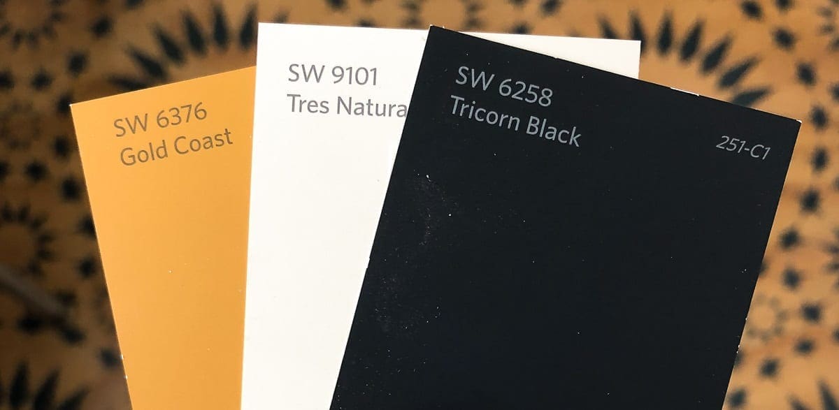
Last night, I picked up a few Sherwin-Williams samples and painted some scrap boards from the basement. This morning, I looked at the choices under natural light.
I think I want to paint the door a gold color, but the trim color is up in the air.


My iPhone is terrible for reading colors, so the Tricorn Black looks way off. However, in real life, it matches perfectly.
I like them both just fine, but neither of them scream just right to me. There’s no doubt in my mind that the black will photograph better, but taking a photo of a room vs. living in it are two very different scenarios.
Just for kicks, I moved the Gold Coast sample into the kitchen to see what it would look like next to the basic white we use often.

Not bad.
Since I still couldn’t picture everything on a larger scale, I popped the colors into the Sherwin-Williams Visualizer and went to town fake painting the entry. It turns out that I am terrible at on-line coloring. If I paint the real entry this poorly, I will never forgive myself.
Here are the basic renderings:
1)

2)

3)

And because I know someone is going to want to see this combo:
4)

Except for the exterior door, I want to strip and seal all of the doors. So, that factors into my decision too. Most of the doors will not be painted any color at all.
After completing this exercise, I eliminated the Tricorn Black and Gold Coast trim right away. The black is too much drama for this house. BHH was built as a summer house, and I try to maintain a lighter, airier feel. An entryway cave isn’t for me.
Even though the Gold Coast trim looks pretty, I know I would tire of it in a hot minute. By the way, I looked into Feng Shui, and a north-facing black door is a positive, not a negative. BHH faces north. Coincidentally, yellow and red are bad. Oops! Too late.
Right now, I am partial to the Gold Coast door with Tres Naturale trim. However, I’m not quite ready to commit. Choosing the right paint color feels like a huge decision.
Feel free to weigh in.


30 Comments
Ame
While I *love* the tricorn black trim (that’s what I used all over my dining room, and on my broom closet door in my kitchen, and will also be using outside on the basement door), and would myself probably use that and also paint the door in tricorn black, I do agree with you. It makes for a very dramatic space and isn’t light and airy at all – more like a warm bear hug. This may shock you (unless I’ve told you before, can’t remember), but color on trim drives me nuts. I vote for either gold coast door with tres naturale trim OR tricorn black door with tres naturale trim. (I like the Citilite in general, but it seems too blue against the wallpaper.)
(Maybe my north-facing red front door is why I’m not a millionaire yet. I *have* been thinking about painting it black ?)
I’m sure whatever you go with will lool fantastic!
Stacy
Your response made me giggle because I put that Gold Coast trim mock-up in there for you! I was so wrong about what you like. 🙂 I’m not sure why I didn’t think of a Tricorn black door with the Tres Naturale trim. What a good idea!
Robin
I agree, with you on the Tres Naturale trim and Gold Coast door, although a black door might also be interesting.
Stacy
This Tricorn/Tres Natural combo did not even occur to me. Thank you! I’m going to add it to the post as a mock-up. Brilliant! This is why I ask for help. 🙂
Ragnar
The Tres Naturale is definitely something to consider! As far as I can tell it is also close to a historic colour, back before titanium dioxide white pigments white paints were usually either slightly yellowish or a pale grey. The paper has a kind of 1920s-vibe to me and light grey woodwork is a perfect match for that. I’d go ahead and paint the doors the same colour though.
Oh and BTW, I also loathe the green and totally understand why you’d want to get rid of that! Returning everything to the original finish (looks to be shellac or possibly faux graining) would be lovely but an insane amount of work! I swore never to touch a heatgun again after stripping absolutely all the doors in a small house (seven of them) but I’m not sure I’ll be able to stick to that.
Stacy
Thank you for loathing the green with me. 😀 I do have a Cobra from eco-strip with makes stripping painted wood so much easier. Even so, it’s a rotten job. This hall has seven doors!
EJ
How about a darker white (more ivory?) for the trim… I agree about the black trim… not in this space maybe in a small room – but not in this space.
I actually liked the gold trim – but its a bit dramatic too.
I think a warmer, darker white (towards ivory) is what I would search for and paint a few to see how they do.
what is the trim in the rest of the house – like the front entry hall?
Stacy
I think the monitor may be playing tricks. The Tres Naturale I posted is a warm beige/ivory. The rest of the trim is a brighter white with a touch of warmth. The foyer was already painted when we moved into the house. The kitchen and dining room are Citilite.
Cathy
Sending this even though I know I’ll face a veritable mountain of opposition: try a spruce sort of dark blackish green. GREEN. There. It’s out.
Green because you do love Dorothy, green because it’s going to be fantastic. Truly.
(ducking now)
Stacy
I picked up a paint chip that color, but it is really baby poop yellow. That is not apparent in the wallpaper. 🙂
Cecelia
I hate to say it, but what about the possibility of picking that lovely light olive green out of the paper and using that as a trim color? Is that obvious, and you’ve already rejected the thought?
I was leaning to the tricorn black, because I think both whites are too white. But tricorn black plus the black ground on the paper is too dark I think. Alternatively, there’s that brownish- bronzey color in the paper, if you have time for another round of color visualizer, I think I’d like to see that or the olive green.
That paper is too lovely to be paired with white trim. It wants to dance with another intense color!
Stacy
The olive green is actually baby poop yellow! I looked at a sample last night. The Tres Naturale is a very light version of the brownish-bronze. The matched brown color didn’t look quite right with the black, but I’ll do a mock-up. That’s a good suggestion.
Cecelia
Maybe some of your cabin vibes mural leftovers are worth a tryout? Greyish-olivey mountain colors!
Stacy
Maybe!
Jennifer
I, too, am always pro-white-trim. Especially since this leads onto the formal entry (front hall? can’t remember your name for it) which is very stunning with its white trim. I like the gold door, but would also consider pulling one of the deeper oranges out of the paper to try, too. I feel like that would help warm up the space a bit more.
But I will admit to a prejudice against the gold as reminding me too much of Sturbridge Village type colonial colors which are not my cup of tea. (Or more probably, the 1980s versions of colonial colors…)
Stacy
You are correct. It’s the formal entry or foyer as we call it. You have a point about the gold color! I was around in the 1980s. LOL
Jennifer
Oh, and I recognize that the phone/laptop screen/etc is not doing a great job of color rendering, so it may very well be a lovely gold color in person, it’s just my computer screen rendering that’s off.
Sherrill
I agree with Ame, trim should not be a color. When painted, it should be a shade of white, (otherwise left Natural).
Stacy
I can’t imagine enjoying a color long-term, and trim is so tedious to paint.
Jeri
I thought I would like the black but I agree that it is too dark and dramatic for the entryway. I absolutely love the yellow door but painting all the trim the same is too much. My first choice is the yellow door with the tres natural trim. ❤️
Stacy
Thanks, Jeri. I’m still on the fence with all of it.
Heidi
I think it’s already been mentioned, but Black door with Tres Naturale Trim? The black trim is striking, but makes the space it soooo dark. That in turn makes the wallpaper seem really dark and overwhelming. It’s truly amazing how just a little bit of light can brighten up a room.
I think you’ve inspired me to experiment with wallpaper in my small office (once I get around to that project).
Stacy
Thanks, Heidi. I’m sorry it took me so long to respond to your comment. Somehow, I missed these last few. I think you and the others may be on to something with the Tricorn door and Tres Naturale trim. I’m still playing around with the ideas. I can’t commit! 😀 How exciting that you are considering wallpaper for your office. It looks so nice in small spaces.
Chad
I think the tres naturale on the trim works – muted enough to play well with the wallpaper. I think the door could be gold, black, or off-white.
As far as colored trim goes, did you ever see how ours turned out?
Stacy
Thanks, Chad! I’m sorry it took me so long to respond to your comment. Somehow, I missed these last few. Also, I don’t think I did see your finished trim. Please send me a link. I would love to see it.
Sharon
I’ve been a reader for over a year now & like what you do with BHH. Like some have said, I thought I’d like the Tricorn Black with it but I”m not digging it in that hallway. Definitely the gold color door with the Tres Naturale trim or the Citylite if that plays better with the foyer trim. That way gives the hallway some levity & takes your eye up to that gorgeous wallpaper.
Thanks for sharing your projects at BHH. It is inspiring!
Stacy
Hi Sharon, Thank you so much for reading. 🙂 I’m sorry it took me so long to respond to your comment. Somehow, I missed these last few. I don’t always have my act together. 😀 I appreciate your feedback about the paint colors. I’m still on the fence but reading what everyone things is helpful.
Vanessa
Can you use the gold at 50% or less even? Bright white is going to off as well, and I agree that the black is too much.
Stacy
Thanks for the suggestion, Vanessa. I’ll play around with it a little.
Chris Edwards
I like the tres naturale color for the trim and black on the door…