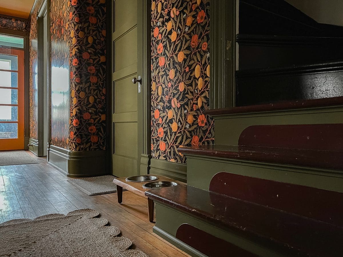
After 3+ years, the front entry is finally finished. Every single item is marked off the to-do list, and it feels wonderful to write that. The front entry is one of those rooms in BHH that remained a relatively low priority for a long time. It’s not even a room; It’s a hall, but in proper BHH form, the front entry is supersized at approximately 4′ X 20′. So as far as work goes, it was a room-sized commitment.
When we first moved in, the front entry floor was covered in beige vinyl, and the walls and woodwork were painted a shiny pale green. Within the first year or two, I painted the walls white and the door dark blue, only a slight improvement. I was just trying to do something different since the entire house, inside and out, was green. I couldn’t take it anymore.

Then, early in 2019, Andy and I refinished the floors downstairs. What a project!
While I secretly hoped for a gorgeous tile floor hidden under the vinyl, uncovering the original hardwood was an acceptable (and expected) consolation prize.

We removed three layers of flooring, red linoleum, 1/2″ plywood (and about a million nails), and the beige vinyl to get to bare wood. All of those layers raised the floor by about 3/4″, and the heater vent cover was trapped beneath it all. Please don’t comment on the dirty, hairy vent. I already know we are gross people.

Once the floors were finished, I started getting excited about updating the rest of the room.

An Entrance Made For Everyone
This next part might get a little confusing. We call the front entry the front entry because we enter it from the street side porch, which most people think is the front of BHH. It certainly looks like the front of the house.

However, the street used to be oriented differently, and the “front” of BHH is actually this side, which leads into the formal grand entry:

What we know as the front entry was a utilitarian entrance created primarily for servants. However, there have been some modifications over time. For example, Dorothy, the previous owner, only used the streetside entry. In fact, when we moved in, the giant front door was inoperable with every crevice stuffed with newspaper, and the locks stuck.
Our family uses both entrances equally. The doorbell works for both, and our friends and family come to either door, but I notice they do play favorites.
With the days of servants firmly behind BHH, I was itching to do a proper makeover on the front entry. It was always such a letdown to enter the house into a boring white hall. The grand entrance is peak fanciness, and I wanted the front entry hall to feel the same. So, I approached Spoonflower.
Fancy Wallpaper
In November of 2019, I partnered with Spoonflower because I had my heart set on wallpaper. Never mind that we’d spend countless hours removing wallpaper from BHH. Why not more? Choosing wallpaper was tough, but I landed on a William Morris repro fruit print in black. (Sometimes, I still wish I had chosen the orange colorway.) By the end of 2019, the wallpaper was up, and we were on our way! The pale green trim was tacky and awful, but I had plans to repaint it. Nothing could stop this project now.

COVID Ruined Everything.
I hemmed and hawed so long about paint colors that a global pandemic started, and all projects at BHH and almost everywhere else came to a standstill. We weren’t sure if Andy would keep his job. So, we stopped discretionary spending as much as possible. Finishing the front entry was off the table.
The “It Looks So Bad I Stopped Taking Photos” Phase
I feel like I am making a long story longer, but a lot of water has passed under the bridge in three years, right? From early 2020 to basically a month ago, we were officially in the phase of the front entry project where it looked so bad that I stopped taking photos altogether. No matter where I was in the house, I would strategically avoid photographing the hall.
The white paint, which felt right at first, was all wrong.

Everything was now a patchwork of bright wallpaper, mismatched green paint, and a bright white that didn’t go with any adjacent rooms. For a long time, I ignored it all because no one came to visit due to the pandemic. The front entry was annoying and awful, but I just kept thinking that I would get back to it someday.
Stacy Pays Someone Else to Paint
Once Andy accepted the job in Salt Lake City, I realized that someday needed to be sooner vs. later. With the guest bathroom remodel going nowhere and a whole load of other projects and family obligations, the thought of repainting all of that woodwork plus three doors and the ceiling was utterly overwhelming to me. When I say overwhelming, I mean I was waking up in the middle of the night many nights per week thinking about how much work it would be. Painting is easy, but it is time-consuming, and time was something I didn’t have. So, I opened up my wallet and paid someone else to do it.
I hired the same people who painted the exterior of our house, and watching everything unfold without having to lift a finger felt amazing. (Local friends, hit me up for the company details.)
I would detail how I chose the colors, but it’s a short story. I was still considering white when I got a nudge from the universe to go bold. What did I have to lose? Over on Instagram, I asked people to weigh in on what they would choose. My one condition was no green. There were many good suggestions, including Curry from Sherwin-Williams. With less than 48 hours until the painters arrived, I headed to my local Sherwin-Williams store to look at Curry and some other colors. When I got there, something came over me, and I just took a design risk. I settled on Curry for the door and ceiling and Eminent Bronze for the trim. No matter which way you look at it, Eminent Bronze is green. I chose green. Who am I?
The Big Reveal
I admit that when I first saw the paint go on, I felt sick to my stomach. When it was wet, the green pretty much looked like newborn baby poop. Even the painters were like, “Oh, this is interesting.” Interesting is polite code for yucky. I was kicking myself for not choosing white. White is boring, but it’s safe and inoffensive. It does not ever look like baby poop.
Then, the green dried, and the second coat went on, and we were all, “Oh, this isn’t bad.” I even thought, maybe it’s good? Then, while he was painting the ceiling yellow, I heard one painter tell another that he was getting strong macaroni and cheese vibes. I still laugh when I think about it. I wasn’t going for mac and cheese, but I do like mac and cheese so…
In the end, it was better than I even hoped it would be, and now, here we are.

It’s dark all day, and that feels fine. The front entry is not a place to linger. Instead, it’s more like a hug on the way to one of the brighter adjacent rooms.


After the painting was complete, I had a rather long to-do list. All those details feel like a post for another day, but here’s the list to give you an idea of the leftover tasks.

I finished everything on the list yesterday.
More Photos
It was challenging to photograph in such a low-light room. So, I will have to share some of the details later when I become a better photographer. Until then, here are a few more of the big picture.


I added the scalloped jute rug as a callback to the curved walls, and since this is a hardworking room, I chose a heavy-duty Waterhog runner for the area in front of the door and a smaller one just outside the basement door.

I admit that I frequently stop and stare at the front entry now because it feels so good to see it finished and it looks as lovely as it deserves.
If you have any questions, please let me know in the comments.

PS: Next week, the One Room Challenge begins! Are you ready to follow along with the guest bath renovation? It’s going to be a doozy.


14 Comments
Cathy Cagle
oh it looks just fantabulous! I LOVE the green, seriously love it. And the curry ceiling is fine, fine, fine.
Nice work, Stacy, really nice work. Let’s form a ‘no more white paint’ club, shall we?
(and ya, I always kinda pine for the other wallpaper colorway but I can get over it now that you’ve gone with big muscley color)
Stacy
Thank you, Cathy! I’m not ready to abandon white altogether, but I am willing to go out on a limb more often. 🙂
Julie McMaster
I have read and enjoyed your blog for years. Thanks for the chronicle of your journey! By the way, the hall is lovely!
Stacy
Thank you so much, Julie. 🙂 I appreciate that you still read the blog.
Pete Linszky
Really nice restoration !!! What material are the riser guards made of ?
TY !
Stacy
Thanks, Pete. The riser protectors are really strange. They are made from rigid plastic, which looks like the same plastic paneling product that people used to put on bathroom walls mid-century. They have three screw holes, and I suspect that someone made them. The brown coating is oil paint.
SH
I would not have picked that wallpaper nor any of those paint colors but I am so so glad you had the creative genius to go for it. Also am relieved that Millie now has a properly restored dining hall 😉
Stacy
Thank you, SH. As you well know, going bold is new for me, but I think I’m getting used to it. 🙂
PS: I love that you named the front entry Millie’s dining hall. Perfect!
Carey
I love the entry. The paper is georgous and the green is perfect. What is the color and brand? I’ll be painting woodwork soon.
Thanks!
Stacy
Thank you, Carey! The green is Eminent Bronze by Sherwin-Williams. Good luck with your painting project!
Barbara H.
It looks great and I know it’s a huge relief to have it done! Looking forward to the One Room Challenge.
Stacy
Thank you, Barabara! It does feel excellent not to enter the house through a design disaster anymore. Now, onto the next room. 🙂
Vivien
you’re a genius ♥ you picked everything i would love to pick for my own home, but can’t.
Stacy
Thank you so much, Vivien! <3